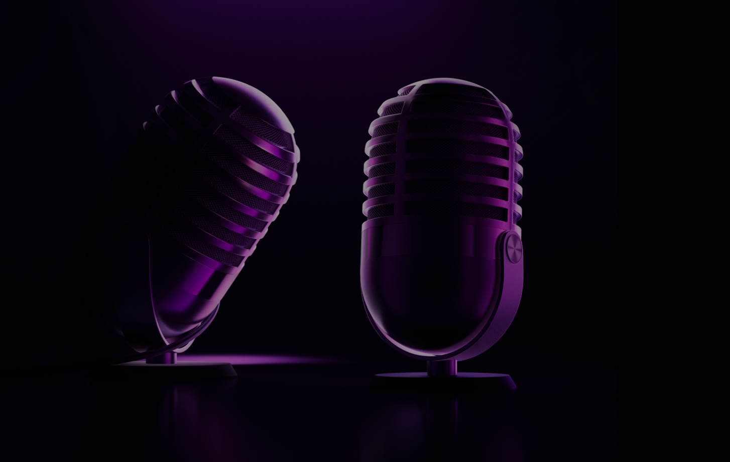
Apple
Podcast
ABOUT THE PROJECT
Redefining the way users discover podcasts
With more than 584 million listeners worldwide, the podcast industry provides lucrative opportunities for both podcasters and marketers alike and offers an effective way for you to connect with your target audience.With thousands of new shows and episodes added regularly, discovery becomes a challenge. The platform’s curation often feels random, making it quite difficult for users to find relevant or high-quality podcasts that truly fits their interests. Instead of using the platform as a way to discover more content they will just use it for its primary features : online listening and download.
Unlike platforms such as YouTube or social media, podcasts offer a limited real-time or direct interaction. Listeners may feel connected to the hosts through regular episodes, but opportunities for feedback, questions, or dialogue are minimal.
This lack of engagement can make audiences feel unheard, and creators may miss valuable insights or community-building opportunities.
YEAR
2025
ROLE
User Experience
Visual Design
Prototyping
CLIENT
Apple
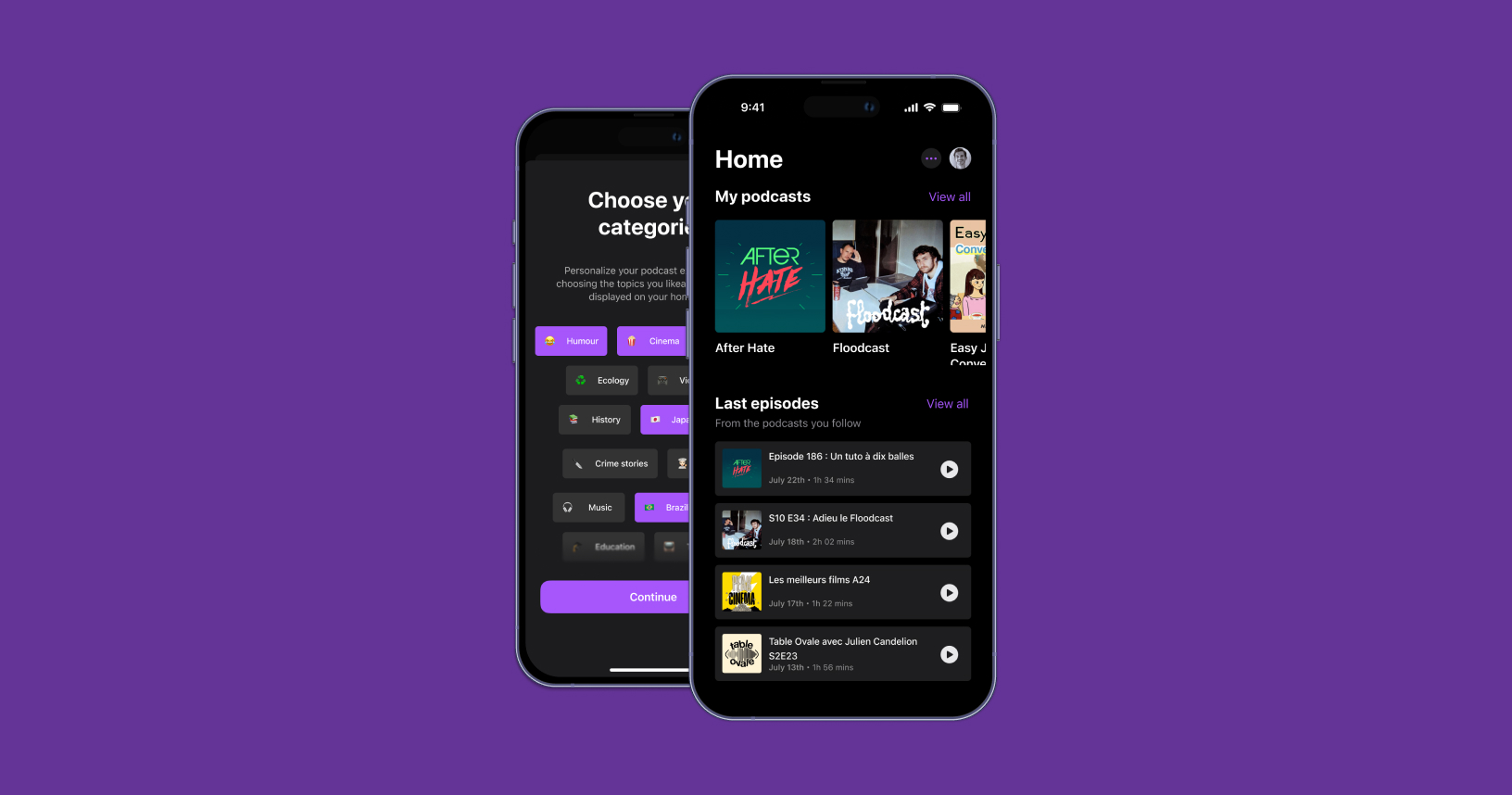
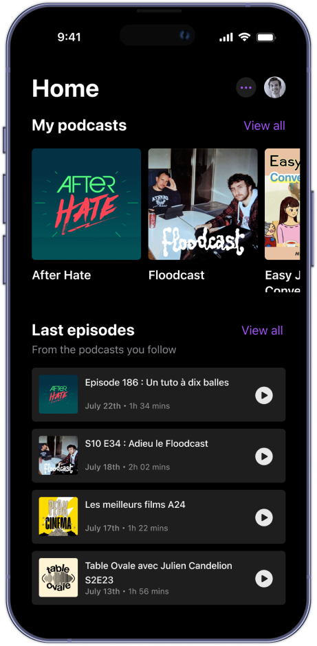
View of the homepage and curation selection
01. RESEARCH
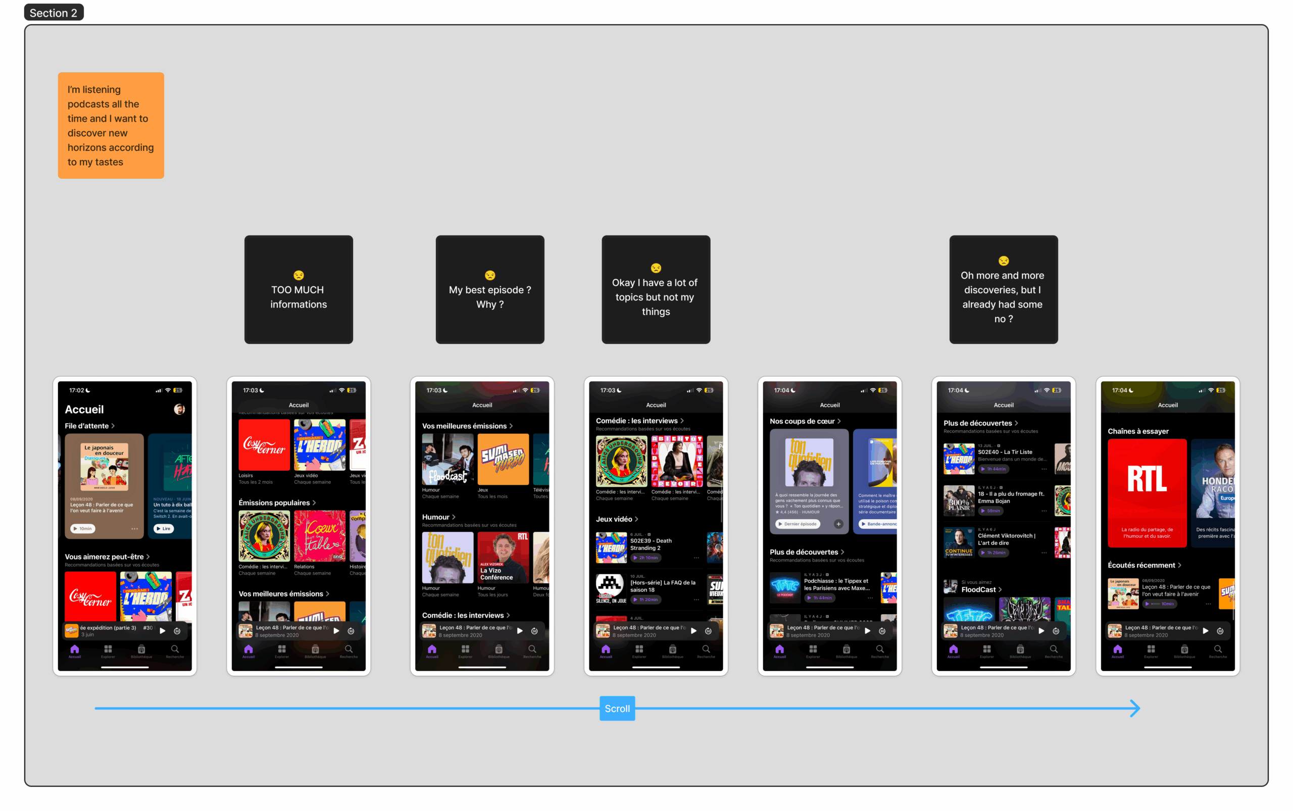
User's journey
Mapping users stories with real life scenarios
After collecting informations from users interviews, I created a user story/empathy to have a global overview of frictions and frustations in the regular use of the app.
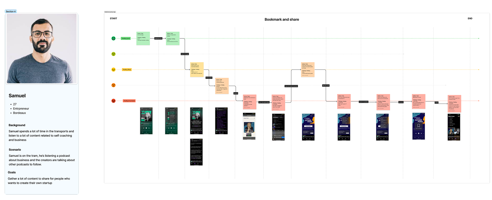
User story for the bookmark userflow
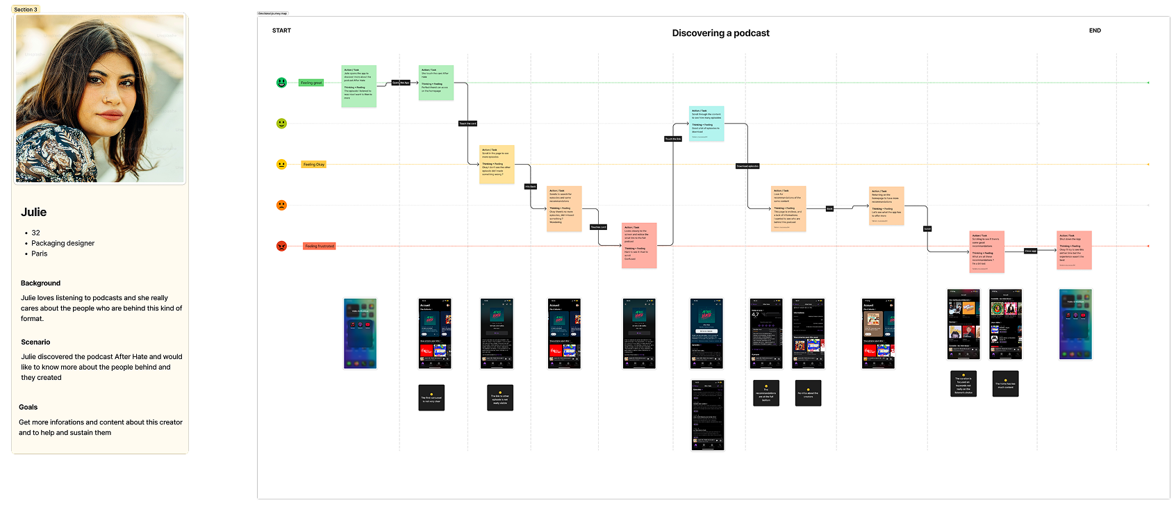
User story for the curation display
Analysing the current app hierarchy an experience
Time to have a deep look at the app and the way informations are displayed and how the workflow works. This step helps to point where the friction might comes.
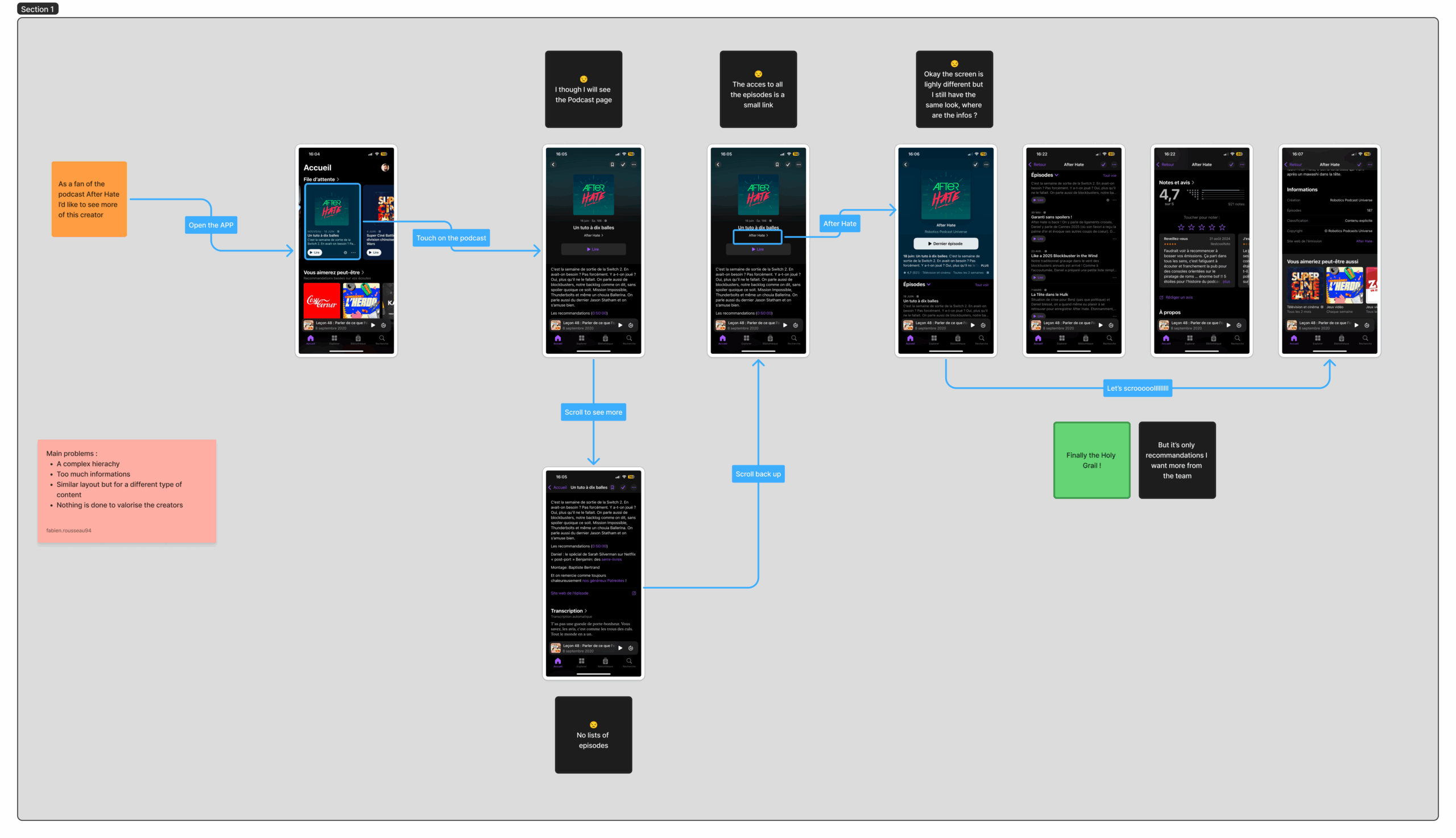
Worflow of a Podcast and the main frictions
Worflow of the home tab, we can see a "too much content" pattern
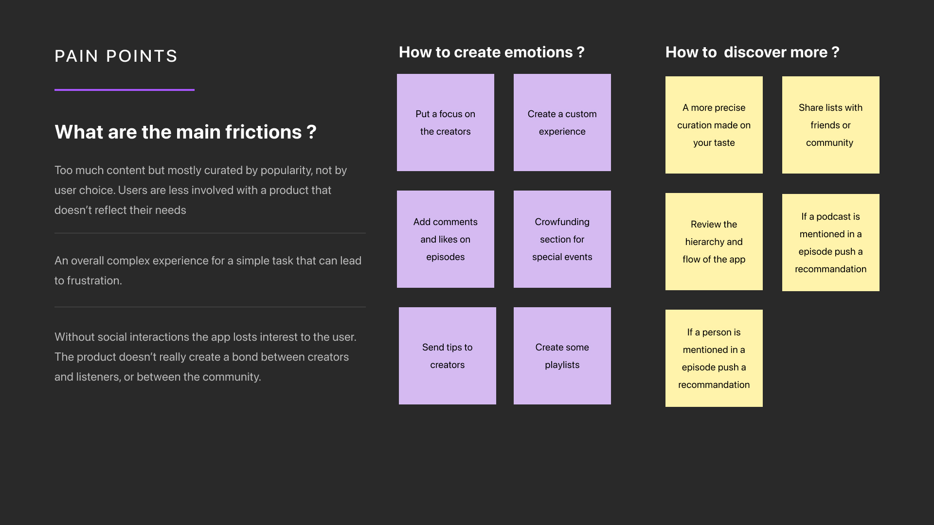
Listing pain points and how to overcome them
I did a list of 2 main frictions that came after all these analsys :
1/ The global experience is frustating by its lack of empathy with the creators, it's just a catalog of content.
2/ The curation based on "what I listen" is not really accurate and we can do better to focus on the user's choice.
User story for the curation display
02. IDEATION
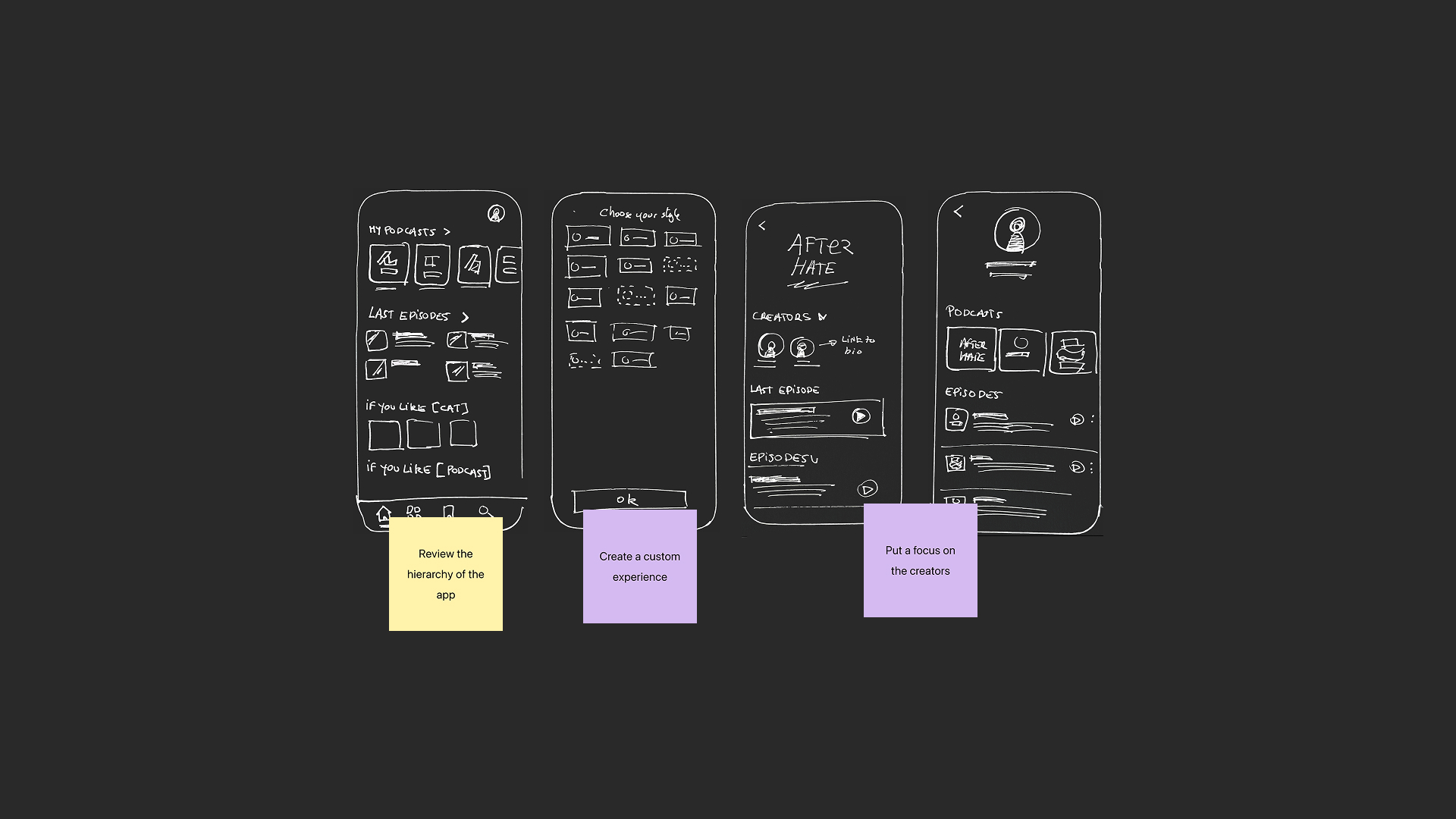
Hand drawn sketches
Transforming ideas into features
I sketched the ideas from the “How might” session in a kind of Crazy 8 (more 10). I tried to sketch 8 ideas in 1 min each for every ideas and to end up with 10 roughs that will help to define a features list.
User story for the curation display
User story for the curation display
Defining the key features
After collecting informations from users interviews, I created a user story/empathy to have a global overview of frictions and frustations in the regular use of the app.
User story for the curation display
User story for the curation display
03. DESIGN
Design
Time to switch to Figma and to convert these ideas
Once the content of screen is validated, I used Apple's design system to create a smoother interface and tried to keep it simple and clean.
Less is more
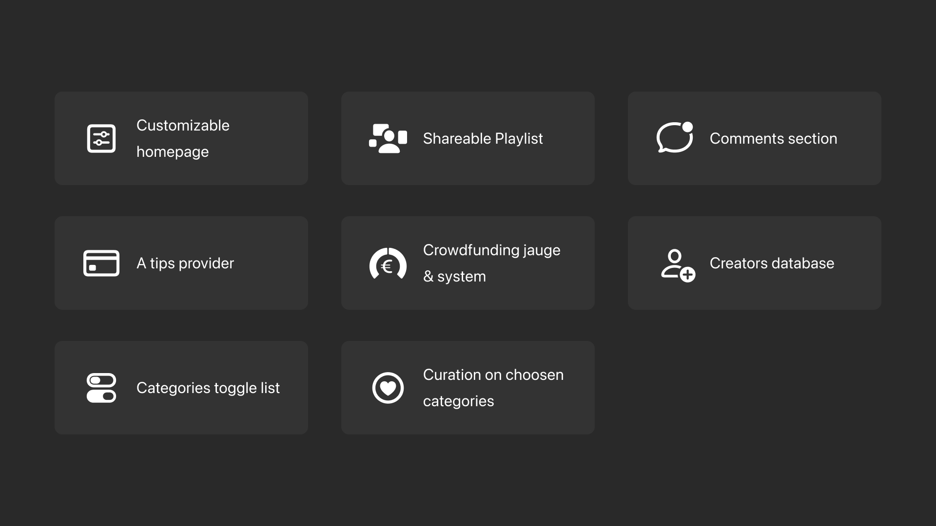
First, the user can quickly choose which kind of content he wants to display. The home screen reflects the user’s mood not the entire catalogue. It starts with liked podcasts and new episodes, followed by easily scannable categories, with deeper content access at the bottom.

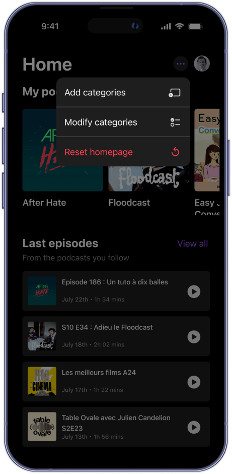
Change at will
Too much info on the home screen? It’s fully customizable via a contextual menu just like Apple products, using drag and drop and simple toggles. Users can even clear everything for a fresh start.
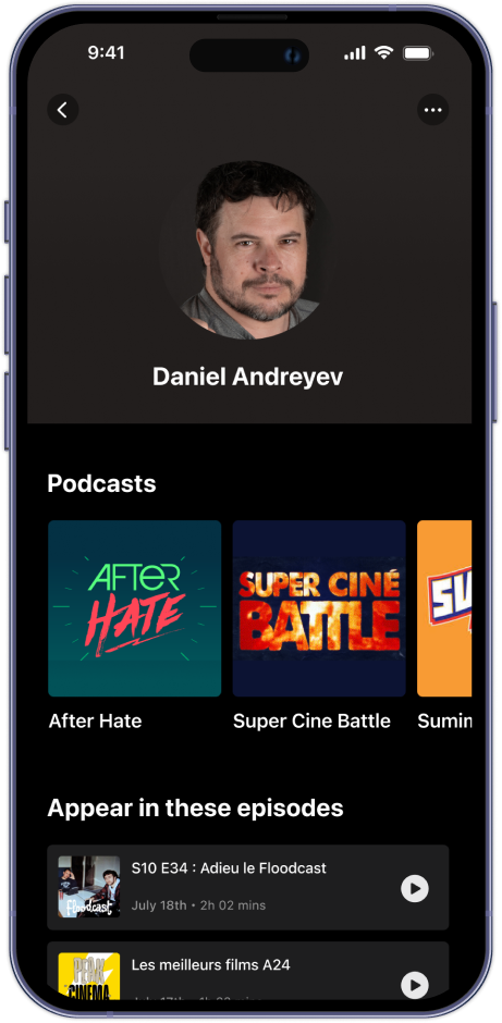
Focus on creators
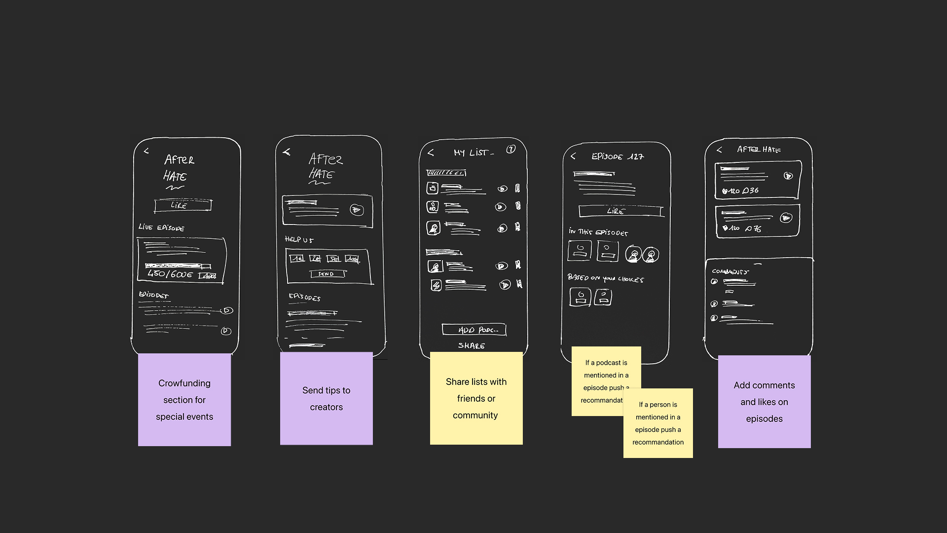
A podcast begins with creators sharing their voices. Highlighting them humanizes the platform and strengthens the connection between listeners and podcasters—while also opening the door to richer, creator-driven content.
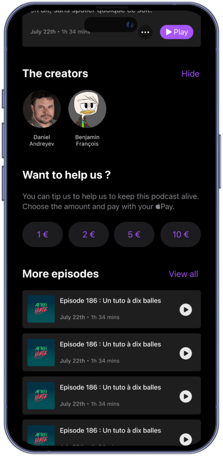
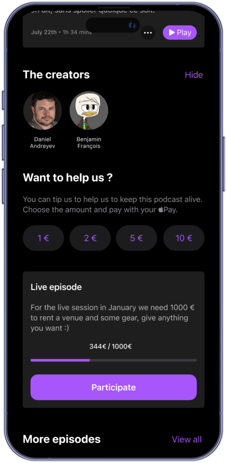
Help creators
Want to support creators? Users can send tips (up to €10) via Apple Pay. Boosting engagement and fueling better content. For bigger needs, special events can use built-in crowdfunding to rally support.

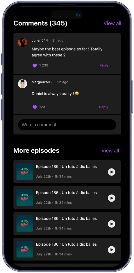
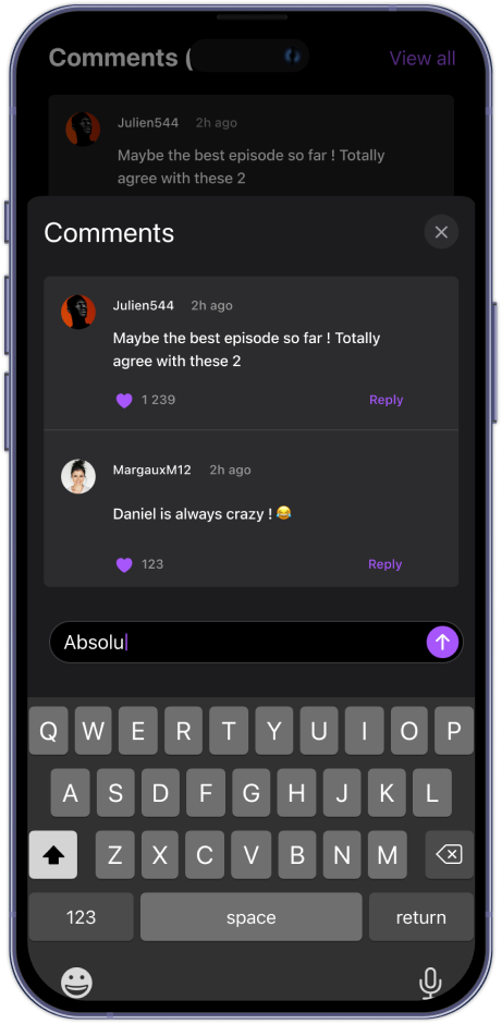
Interactions between listeners
Adding comments boosts interaction by giving listeners a voice. It creates space for feedback, discussion, and connection—turning passive listeners into an active community around each episode.
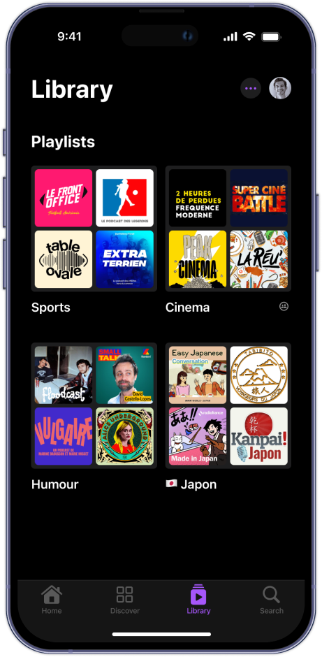
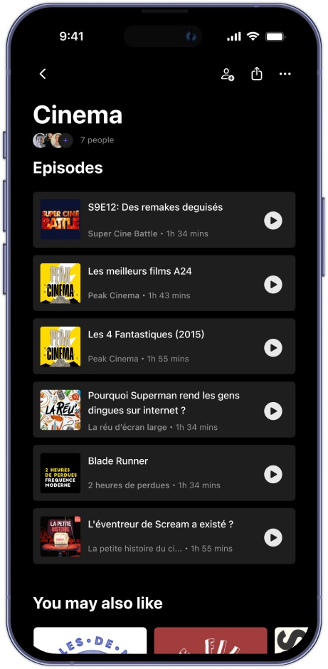
Playlists
The best way to discover Podcast is by other people. It makes sense to give the possibility to create a shared playlist that anyone can edit. This will increase the discoverabilty of more podcast.
04. CONCLUSION
What are the expectations ?
A smoother and intuitive design will help users to discover new shows or manage their library effortlessly. Which brings a better experience troughout the process and leads to a greater satisfaction.
Getting them emotionally involved with creators will ensure a better usability of the product. They don’t just use the app for listening, they also use it to be a part of a project.
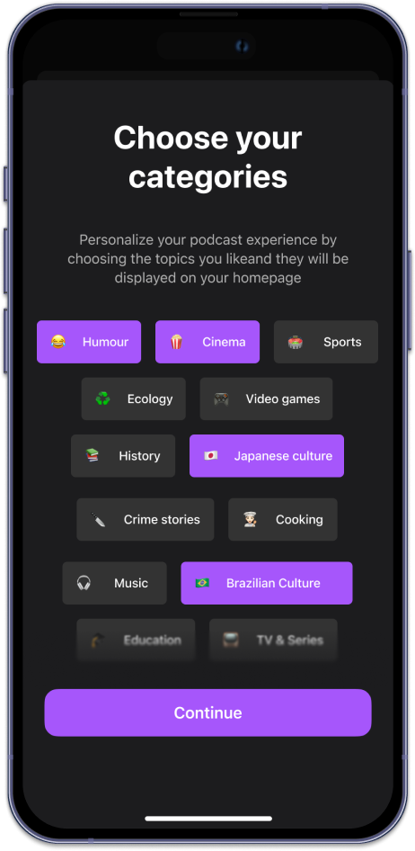
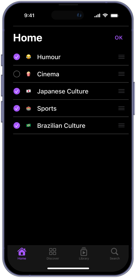
Giving the choice of topics/categories will give to the user a full control on his content. Every user will have his own app with his own feed. This will help to give the best curation and to discover more quality content.
The possibilty to create shareable playlists will also increase the discovery of the catalogue. A curation made by close people is always the best way to discovery.
