Hubside Companion
Year
2022
Role
Userflows
Prototypes
User tests
UI Design
The project
The brand Hubside needed a native app to help clients to discover, use the content of their offers. The idea was to convert the free users to paid users.
The problem
The first build of the app was just an acces to your profile and the information about your offer. We needed to propose something better, faster smoother. So we decide to start from the beginning : using the guidelines of Apple & Google to create a real companion app and add the in-app purchase.
The process
The first I did was an audit of the “app”, showing the weakness of the product and which things could be improved. Then I did a quick draft of the new app with Apple’s guidelines just to have some insights from developers and stackholders. I did a prototype for them to test the idea of a simple way to use the app.
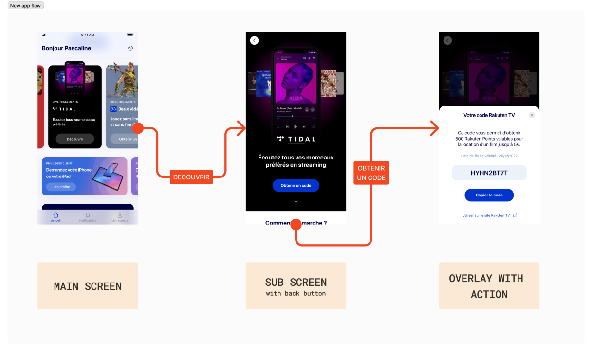
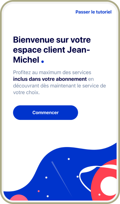
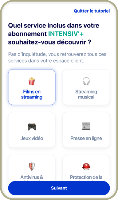
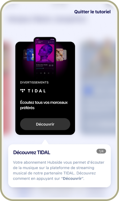
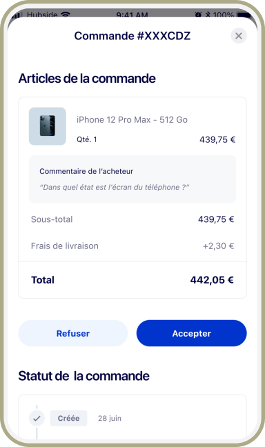
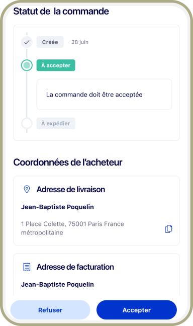
The main idea I wanted to test was to refine the experience with a maximum of 2 to 3 screens for an action, : having 1 sub-level and use a modal sheet for the last action. In this exemple the user need to generate a code to use his streaming option, so on the home he touchs the card which displays the sub level wih more information. Then the main action (get a code) displays a modal sheet with the code and more infos. The goal here is to focus the user on the main flow/interaction.
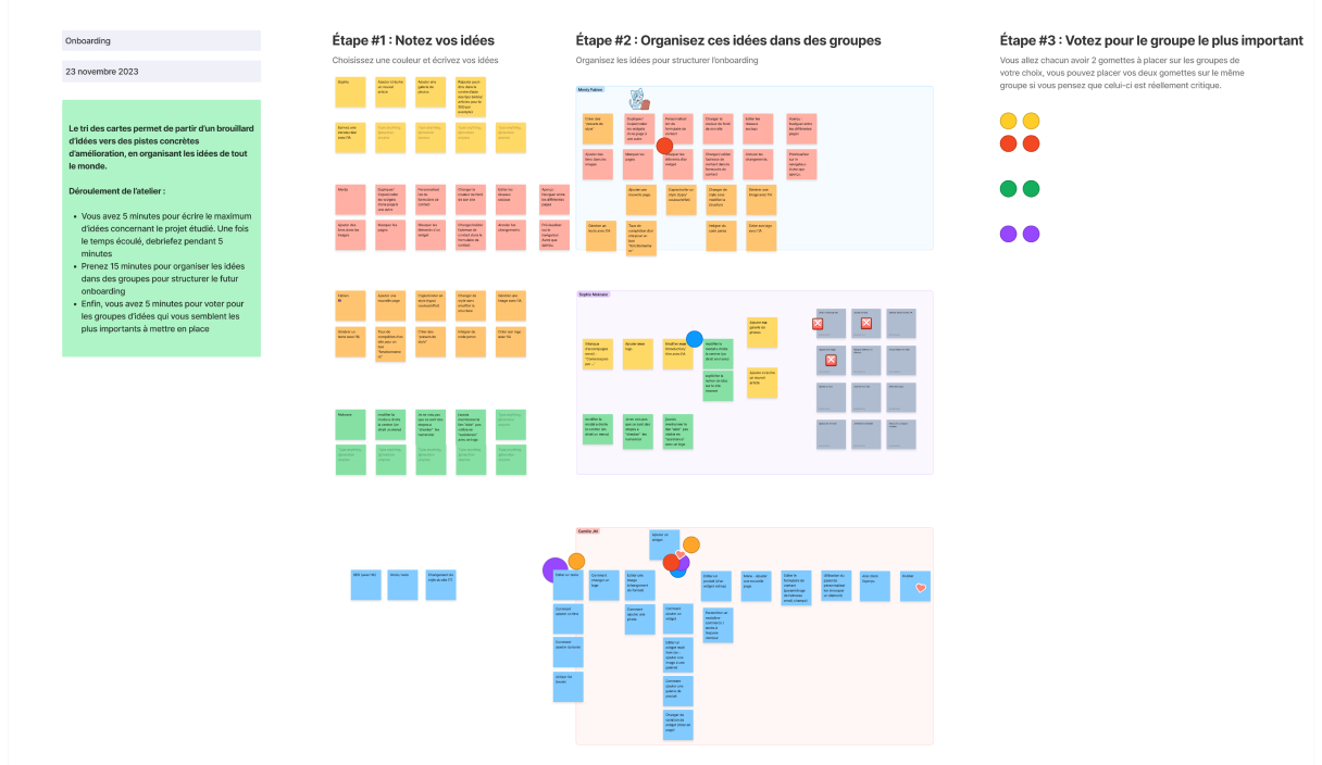
Once the POC passed the validation from stackholders, it’s time to work closely on the features included with some card sorting. So allthe App product team gives idea and we define the most important for the MVP.
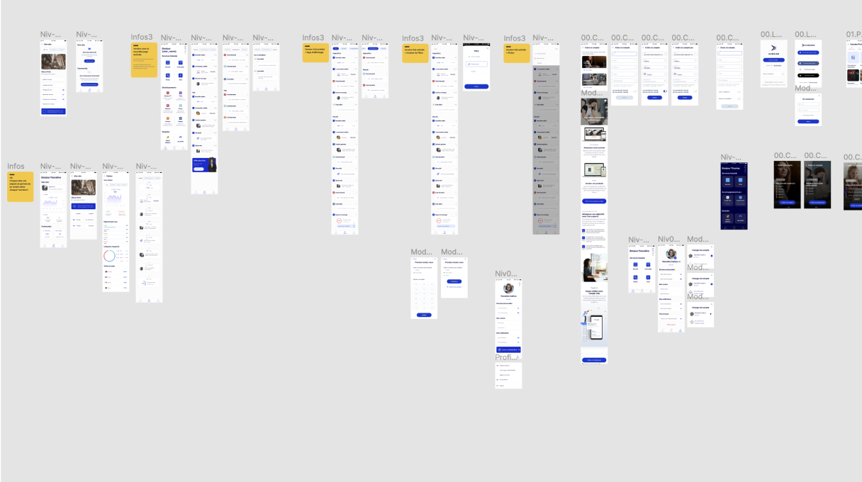
And then comes the fun part : research. Different styles, experiences (too much artbords to display but imagine a huge board with a lot and a lot of concepts and prototypes that we used to test with some users.
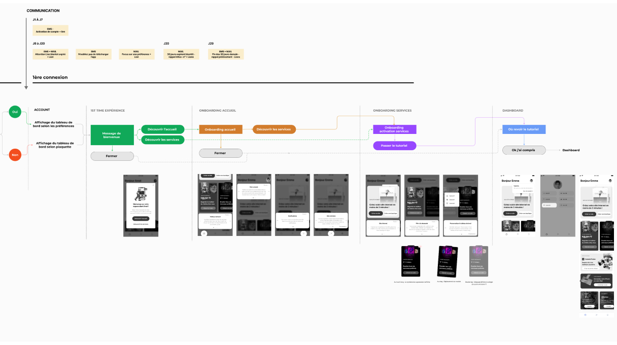
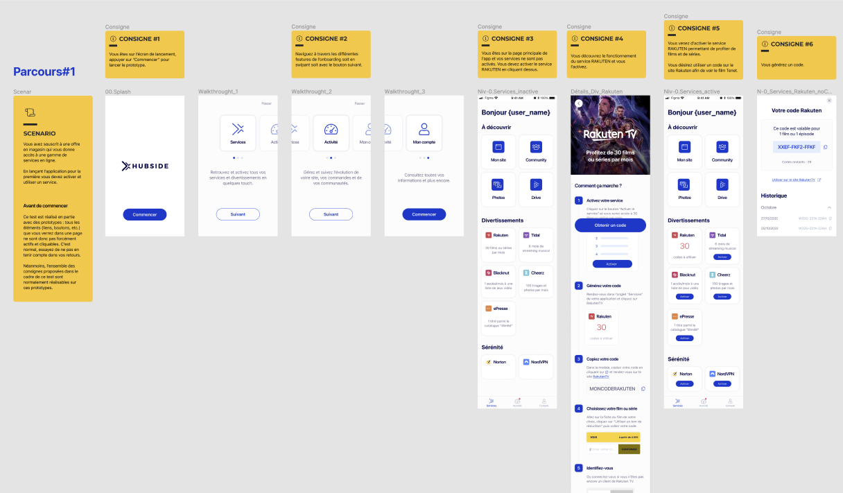
During all this process, some userflow put the light on some difficulties, with some features. In this exemple, we had some interrogations about the first time expereience of the app. Will the user understand the product in the few second after opening the app ? What type of onborading should we have to do ?
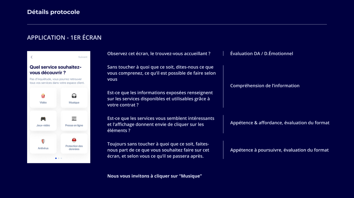
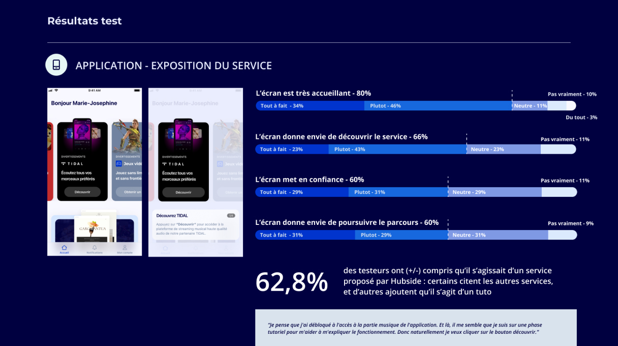
So we decided to do a user test on this (with the toll Testapic) to have some feedbacks. Here some screens from the test protocole and some results.
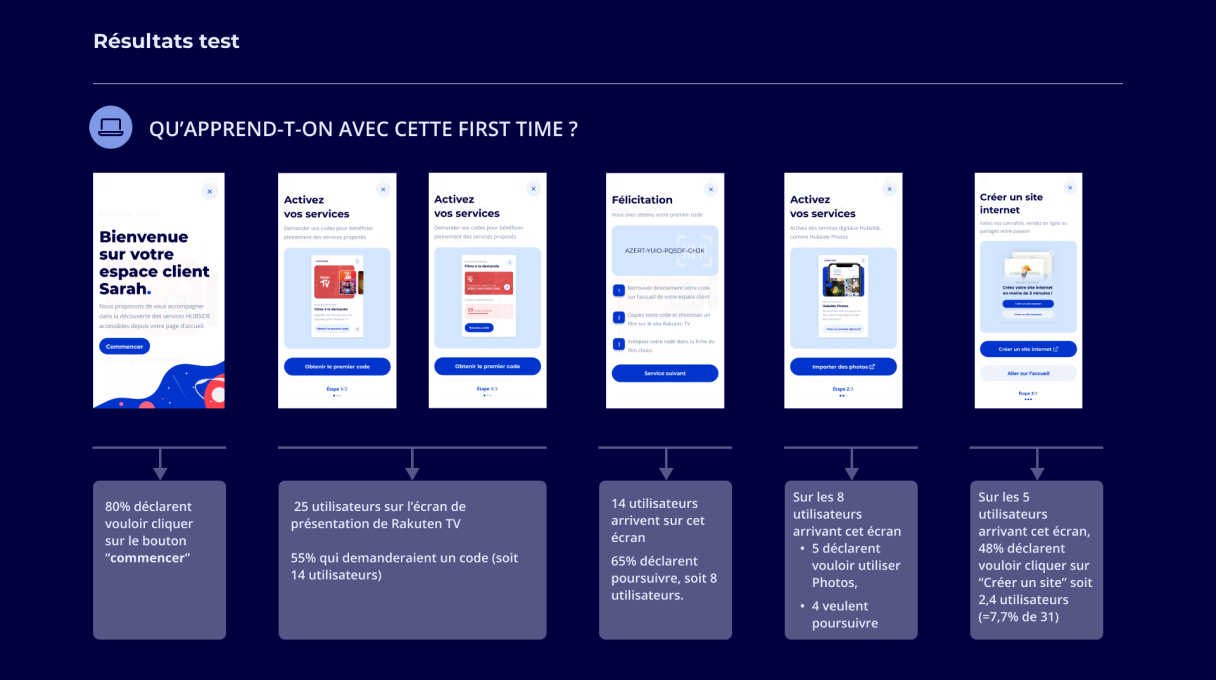
The result
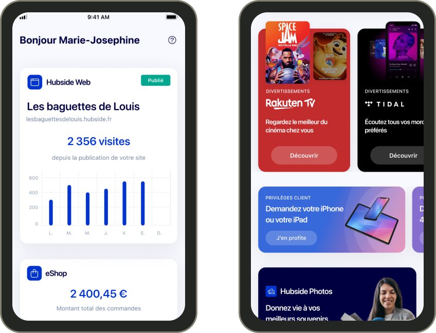
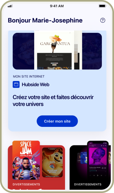
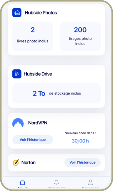
After all these months of process, here comes the final product. I displayed some userflows instead of only screens.
FIRST TIME EXPERIENCE
DASHBOARD INACTIVE VS. ACTIVE
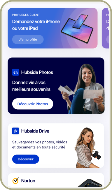
MARKETPLACE
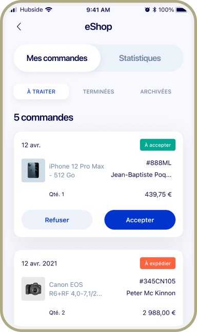
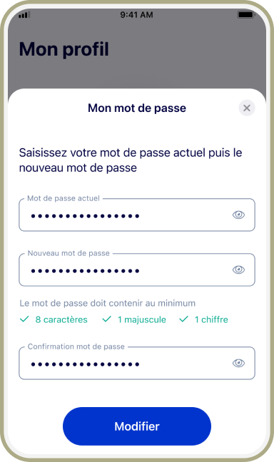
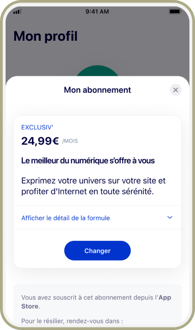
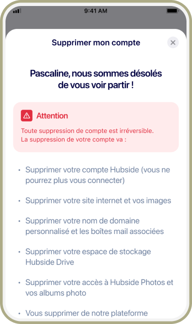
MY PROFILE
Download the app
You can still use the app, the UI is a bit updated but the experience is the same :)

