 BACK HOME
Investir

ABOUT THE PROJECT
Making investing easier and faster
After the success of "Les Echos app", the brand "Investir" set out to create its own experience—one designed with a fresh, friendly, and intuitive UX/UI approach.
This new trading app puts clarity and simplicity first: clean navigation, smart tools that feel effortless to use, and a design that helps users focus on what matters most—the markets.
From real-time data to personalized insights, every screen is crafted to make investing easier, smoother, and more enjoyable for everyone, whether you’re a beginner or a seasoned trader.
YEAR
2017
ROLE
User Experience
Visual Design
Prototyping
CLIENT
Investir/Les Echos
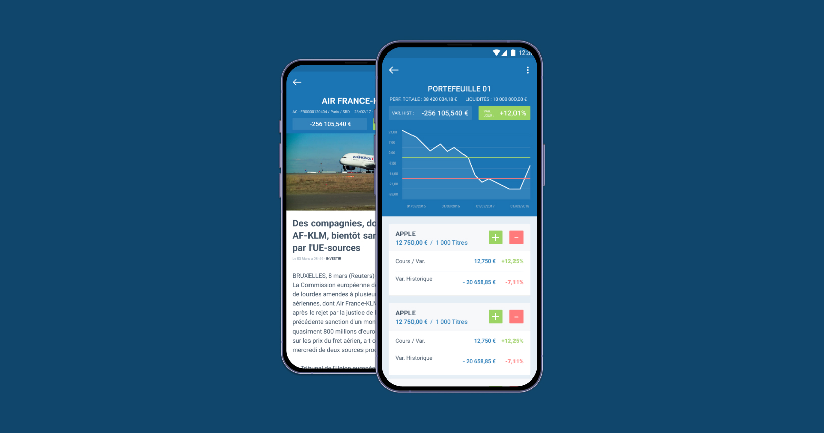
View of a portfolio and a value sheet
01. MORE ABOUT THIS PROJECT
A bit of context before going on
A complicated history
After our post-mortem meeting, the project came back with a clearer vision and a renewed sense of direction. We took the lessons learned, identified what truly mattered, and reshaped our approach with simplicity and teamwork in mind. The result is a stronger, more focused project—grounded in transparency, smarter processes, and a shared commitment to doing things better moving forward.
A limited budget
Despite a limited budget, the project moves forward with a sharper focus and a more intentional use of resources. The constraints pushed us to prioritize what truly delivers value, streamline our approach, and adopt smarter, more efficient solutions. Instead of holding us back, the budget became a catalyst for creativity—driving lean decision-making, clearer priorities, and a more resilient project overall.
The sands of time are running fast
With only three months to deliver the MVP, the project embraced a fast, focused, and highly collaborative rhythm. The tight timeline helped us concentrate on the essentials—core features, clear user value, and a streamlined workflow. By aligning quickly, cutting unnecessary complexity, and keeping decisions pragmatic, we turned time pressure into momentum, allowing the team to move with purpose and deliver a meaningful first version on schedule.
A lack of digital knowledge
Creating an app from scratch becomes tricky when a client doesn’t understand — or doesn't want to engage with — the design process. Wireframes and early co-creation weren’t options; they wanted full-color screens with real content from day one. To bridge that gap, I relied on the design system built for the Echos’ app to quickly produce high-fidelity, interactive prototypes. It meant extra design effort, but it made collaboration much smoother.
02. DEFINE
Let's start by a What ?
A simple question but a lot of insights
To establish a clear foundation for the app, we simply asked to the editors what their subscribers actually wanted. Gathering their expectations gave us concrete, user-driven insights that shaped the core features and ensured we were designing around real needs rather than assumptions.
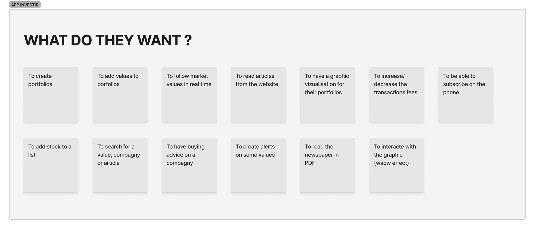
A list of the requirements from the editors' team (not a feature list)
Define the main users
We mapped out the app’s primary user groups to anchor the experience around their real needs: traders, journalists, and investors at both beginner and advanced levels. By identifying their motivations, workflows, and levels of expertise, we could tailor information hierarchy, interaction patterns, and feature priorities to ensure each profile could quickly reach value with minimal friction.

We defined the different types of users that will use the app
03. IDEATION
User flow and wireframes
Mapping the paths to key actions
We created user flows to pinpoint how each user type would access the app’s core trading features. Mapping these paths helped us clarify what mattered most, streamline navigation, and ensure that key actions—like checking market data or placing a trade—felt intuitive and efficient from the first tap.

Overview of the main features of the app (creating portfolios and lists)
Sketching to shape a clear hierarchy
We sketched early screen concepts to quickly explore how information should be prioritized. Working in low-fidelity let us experiment with layouts, test different hierarchy options, and make fast decisions about what needed to stand out—long before moving into detailed design.
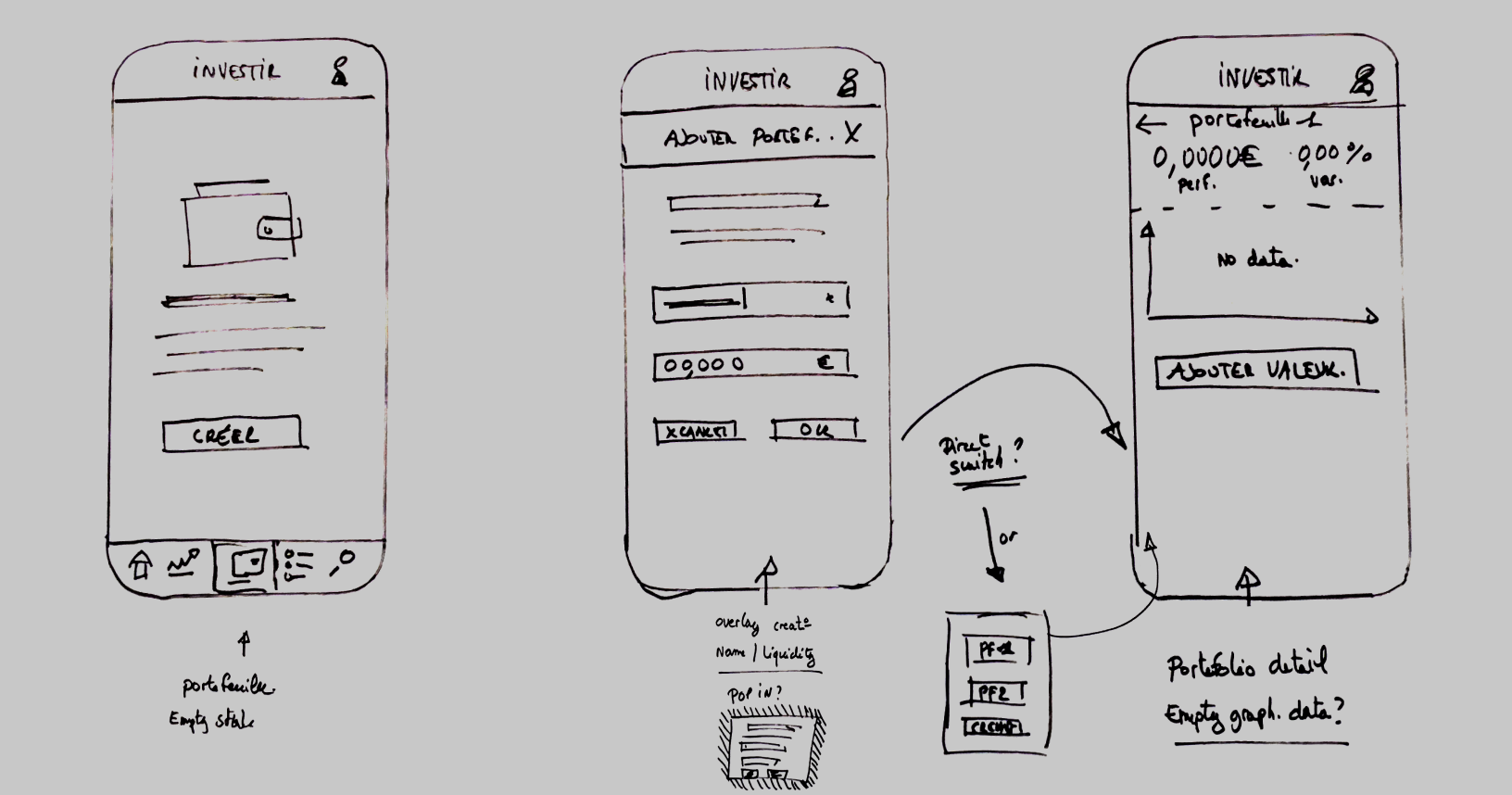
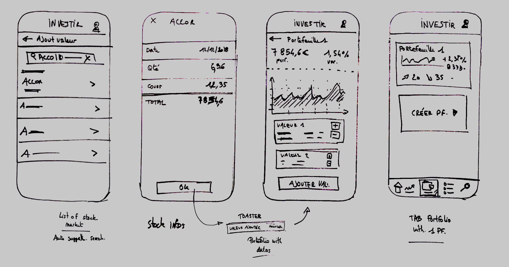
Early sketches of the creaton of a portfolio
03. DESIGN
Building a clean and modern design language
Leveraging Material Design for familiar and faster experience
We relied on the Material Design guidelines to accelerate the creation of the app. Using established interaction patterns and components meant users could instantly recognize how things worked, reducing friction and speeding up onboarding. It also allowed us to move quickly in design and prototyping while ensuring a consistent, intuitive experience across the product.
Colors

Fonts

Navigation

UI elements

04. APP FINAL DESIGN
Bringing the interface together
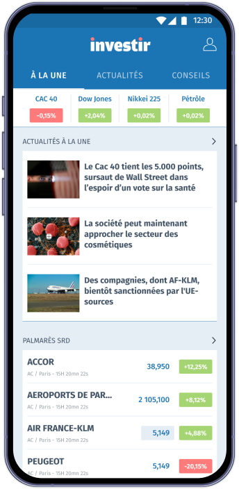
Designing a clear and scannable home screen
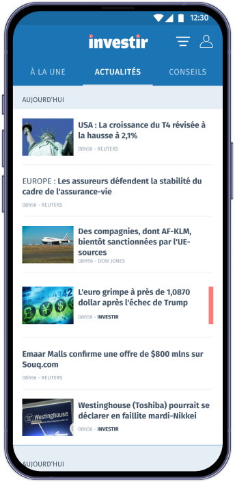
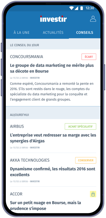
For the home screen, we focused on three essential content areas to help users get oriented fast: a “latest updates” feed for immediate, time-sensitive info, a broader news feed for ongoing market coverage and a “editor’s choice” section highlighting curated, high-value content. This structure gives users a quick snapshot of what matters most while keeping deeper exploration just one tap away.
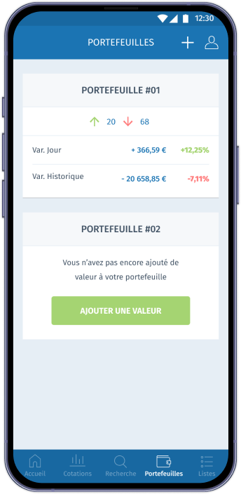
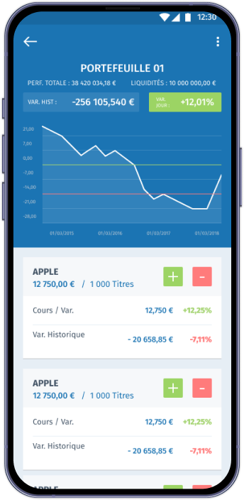
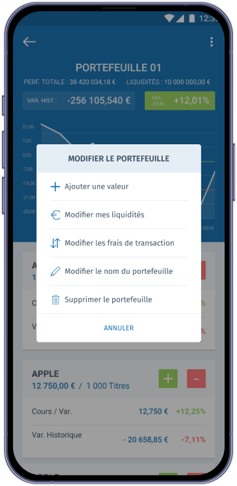
A simplified, insightful and flexible portfolio page
For the portfolio page, we focused on making asset management both clear and effortless. Users can quickly create and edit their portfolio, then instantly access a concise overview of their market balance. This fast, flexible setup helps them understand performance at a glance while keeping deeper insights just a tap away.
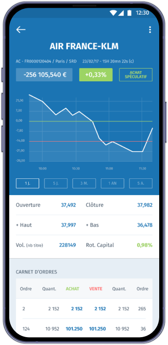
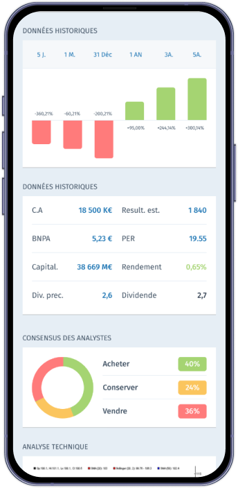
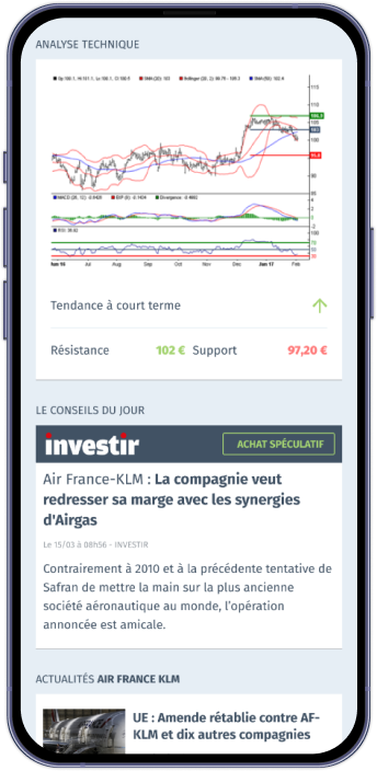
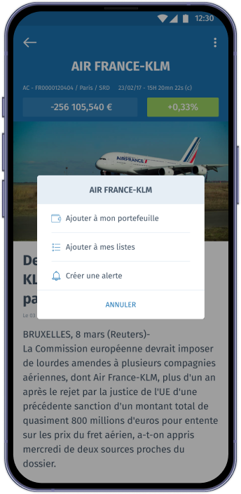
A clear, data-Driven trading page
For the trading page, we designed a space where users can dive into a detailed analysis of each company. Key data, trends, and expert insights are presented in a clean, digestible way, helping users make informed decisions without feeling overwhelmed.
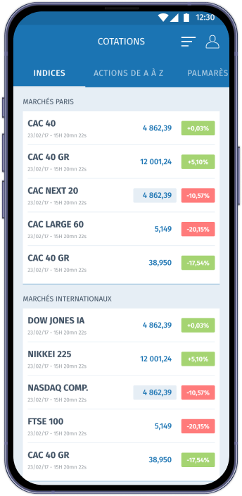
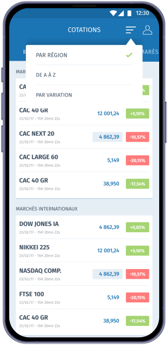
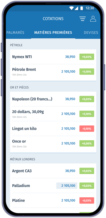
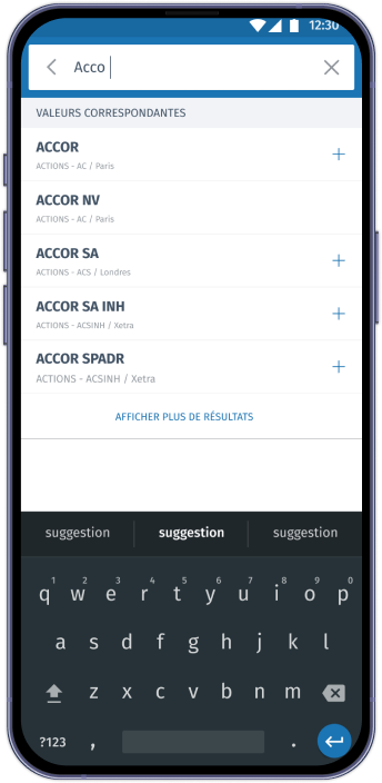
A complete, filterable view of the markets
The Markets tab offers full access to data across multiple categories—currencies, raw materials, top performers, and flops. Users can easily filter and sort this information to highlight what matters most to them, making it simpler to spot trends and compare market movements at a glance.
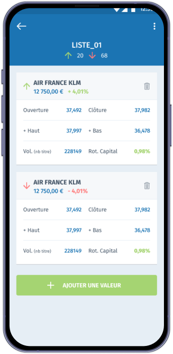
A harmonized watchlist experience
For the watchlist tab, we reused the same user flow as the portfolio to keep the experience consistent and intuitive. This harmony in structure and interactions helps users navigate effortlessly, making it easier to track the assets they care about without relearning new patterns.
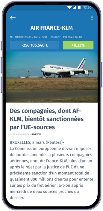
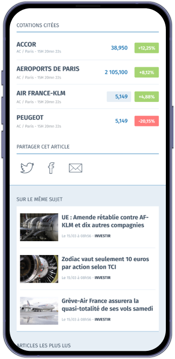
An article page built for deep insight
The article page is designed for focused, in-depth analysis, giving users a clear and structured view of all information related to the stock market topic they’re reading about. Detailed content, supporting data, and related insights are easy to access, helping users dive deeper without losing their way.
04. INNOVATE
Design smaller but better
Building a focused, wrist-ready experience
We designed the Apple Watch version to offer a compact, instantly readable interface. By prioritizing data visualization and using a simple, high-contrast color scheme, we ensured key metrics stand out clearly at a glance. The layout highlights only the essentials—quick insights, core market data, and timely updates—creating a fast, efficient companion experience tailored to the constraints of the watch screen.

Userflow of the app we wanted...
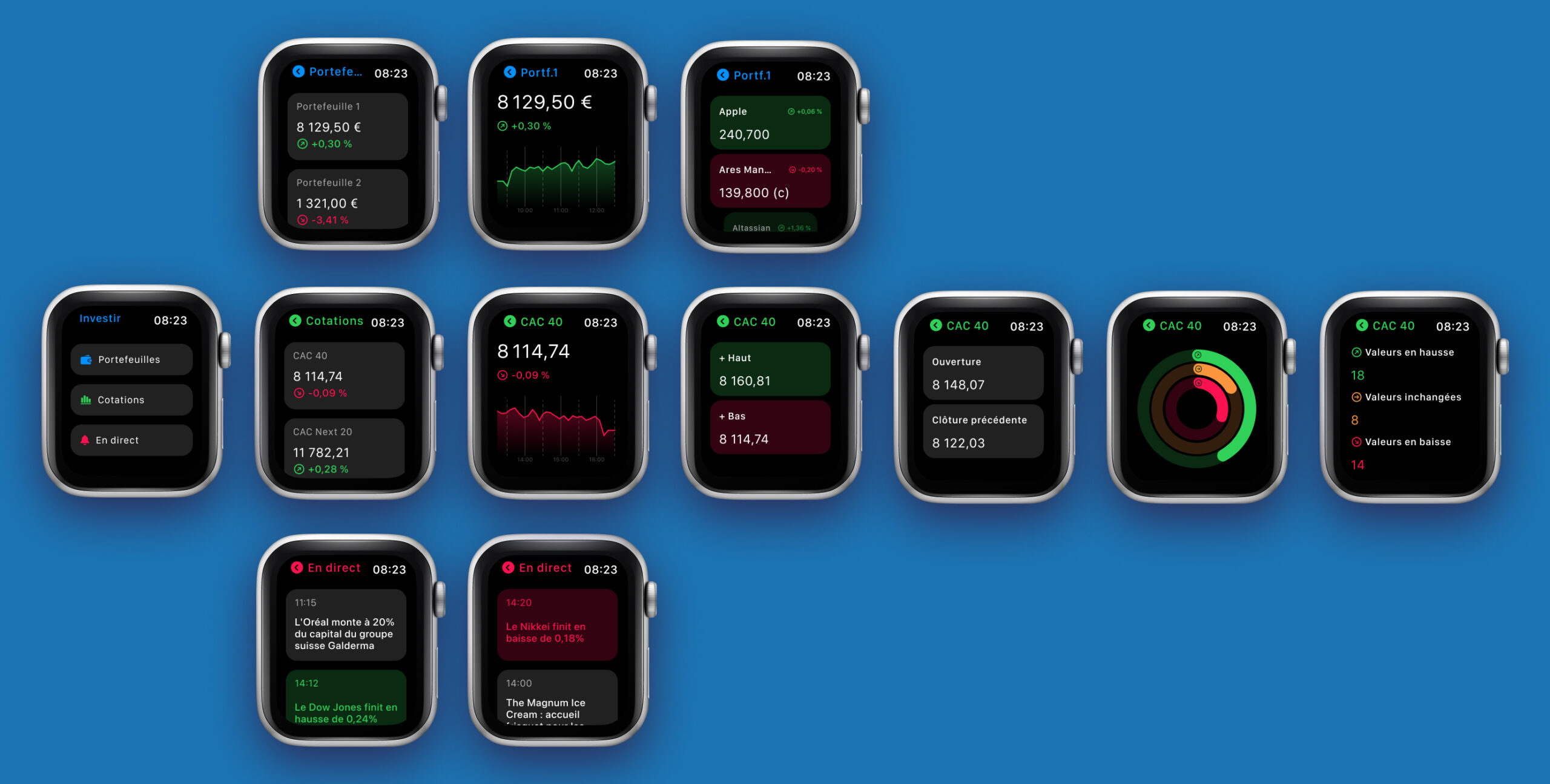
...and the final design with main features : portfolio, stock markets and newsfeed.
05. CONCLUSION
Key learnings from this project
Designing with speed and intention
This project pushed me to work faster without losing clarity. By tightening my process, prioritizing the right tasks, and avoiding unnecessary complexity, I learned how to deliver meaningful outcomes efficiently while keeping the design quality high.
A mobile design system as a production booster
Creating a mobile design system early on, gave me a solid foundation to build from. With components, spacing rules, and interaction patterns already defined, I could generate screens and iterations much more quickly. It allowed the project to stay cohesive, scalable, and visually consistent from day one.
Bringing developers in early for better alignment
Looping developers into the conversation from the start made a huge difference. Early technical feedback helped refine the scope, reveal constraints, and confirm feasibility before investing too much time in design. This collaborative approach kept the project grounded and reduced friction later in the build phase.
Simplicity doesn’t equal lack of depth
One important reminder: a simple interface doesn't mean a simple product. Stripping away noise and focusing on clarity often requires more thought, not less. A clean, minimal UI helps users move confidently, understand information faster, and stay focused on what matters.
Keeping users at the center of every decision
Above all, the project reinforced one core principle: the product only makes sense if it aligns with user needs. Listening, observing, and designing around real user expectations shaped every major decision. It’s the foundation that makes the final experience relevant, intuitive, and genuinely useful.
