 BACK HOME
Les Echos

ABOUT THE PROJECT
A smarter way to stay informed
In 2017, Les Echos needed to rethink its mobile experience from the ground up. The redesign aimed to create a unified app that respects the native principles of Android and iOS, ensuring a seamless and familiar experience on both platforms. Beyond visual harmony, the project focused on redefining how readers will discover and engage with content — turning the act of reading the news into a more fluid, exploratory, and delightful journey.
YEAR
2017
ROLE
User Experience
Visual Design
Prototyping
CLIENT
Les Echos
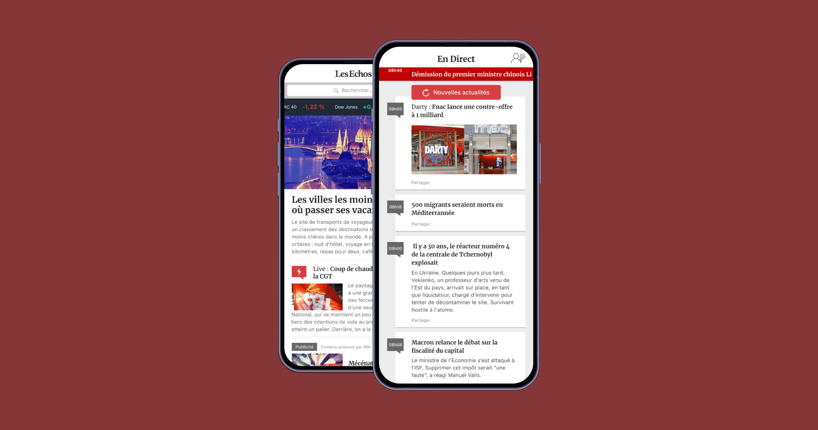
View of the personnalized homepage and news feed
01. INSIGHT & PROBLEMS
What are the main problems ?
The mobile app is an embedded website
A web wrapper can’t deliver the smooth, intuitive experience users expect from a native app. Embedding a site limits the tactile, seamless experience users expect from native design.
No personnalized content
Without personalization, the app struggled to build a connection with its audience. The experience felt uniform and impersonal, offering no sense of discovery or ownership over the content.
The news feed is often outdated
The news feed often displayed outdated content, creating a sense of stagnation in an environment that should feel dynamic and alive. Readers couldn’t trust the app to deliver timely updates, which weakened its role as a go-to source for fresh, relevant news.
The app doesn't display my library or my purchases
The absence of a clear library or purchase history made the app feel impersonal and disorganized. Readers expect a seamless way to manage their content, but instead encountered uncertainty and friction.
Analysing the current app hierarchy and experience
Time to have a deep look at the app and the way informations are displayed and how the workflow works. This step helps to point where the friction might comes.
02. IDEATION
Breaking down the walls
Thinking of an experience with a tab navigation
The first step was rethinking navigation: moving away from a web-style hamburger menu to a cleaner, more intuitive tab bar. By doing this I also split the content in different typologies.
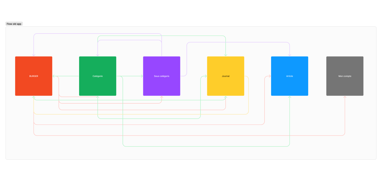
The navigation before design workshops
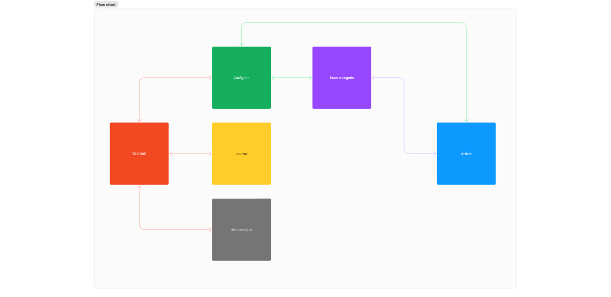
Navigation after some workshop, simpler, faster and more intuitive
Brainstorming and post-it
With a group made of journalists, editors and product teams we start to list all the features they want inside the product. Then we will use the MoSCoW method to built up the MVP.
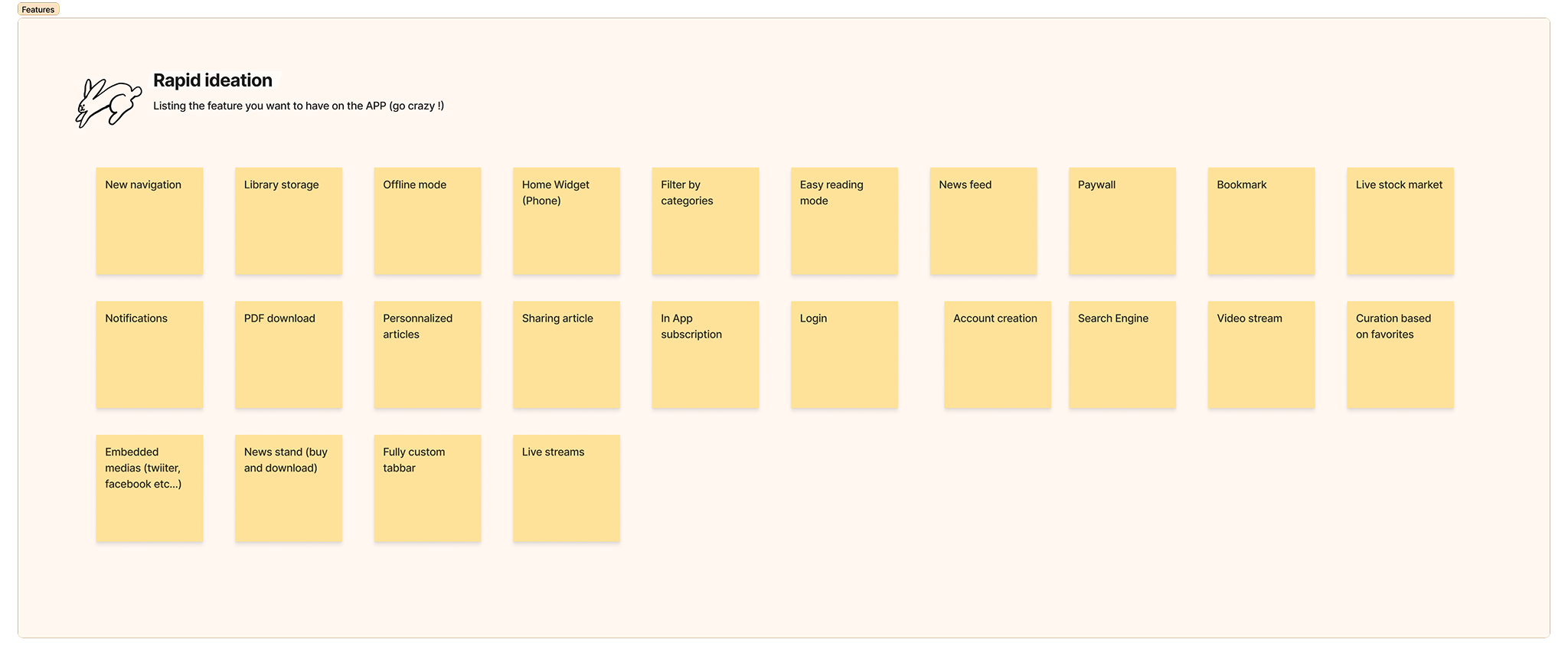
A quick ideation worshop to have a list o feature for the app

The MoSCoW method was used to filter features by priorities
03. DESIGN
Crafting a modern identity
Digitalizing the newspaper's design
The app features a clean and simple design that focuses on clarity and ease of use. Its interface combines a refined serif font with a light, modern typeface, creating a balanced aesthetic that feels both elegant and contemporary. Every element is thoughtfully placed to enhance usability without unnecessary distractions, resulting in an experience that’s efficient, intuitive, and visually harmonious.
Colors

Fonts

Navigation

Icons
04. FINAL UI
Let's put all the elements together and built an awesome app
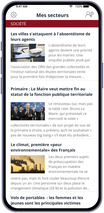
A new home page that focuses on subjets that matters
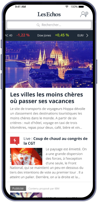
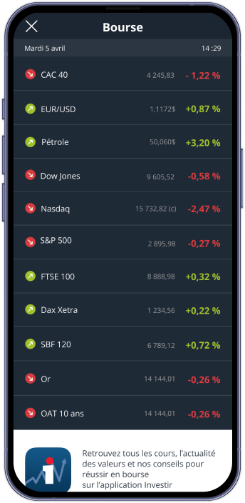
The new homepage brings a breath of fresh air, clean, open, and effortlessly readable. A new customizable card adds a personal touch, letting each user shape their homepage to fit their rhythm. With stock markets now just a tap away, exploring trends and tracking updates feels smoother and more natural than ever.
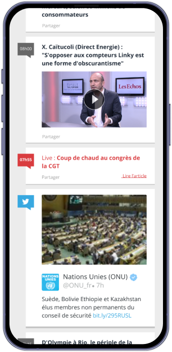
Get acces to informations in real time
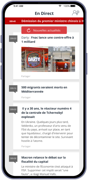
The new live feed is designed to deliver real-time information through a fluid, engaging interface. Its dynamic layout integrates multiple content types — from Facebook and Twitter posts to videos — creating a richer, more connected experience. With smooth interactions and intuitive visuals, users can explore updates seamlessly without ever leaving the app’s flow.
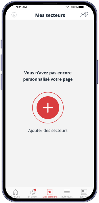
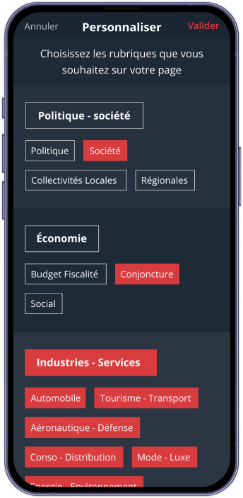
Manage your own content
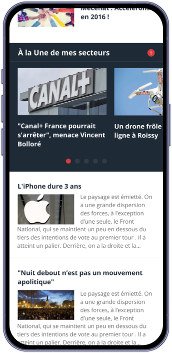
The new custom sections feature empowers users to shape their experience by organizing content their own way. Designed with flexibility and clarity in mind, this personalization enhances usability, making the interface feel more responsive, engaging, and uniquely tailored to each user’s needs.
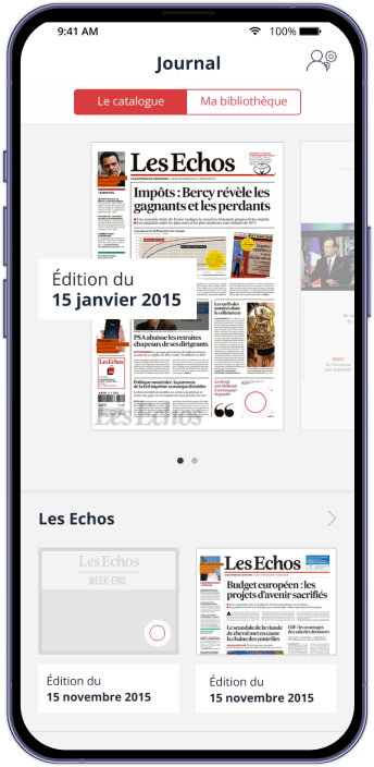
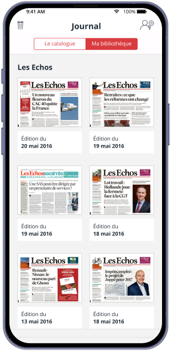
Get access to all magazines and newspapers
The new Library feature offers a clean, structured space dedicated to reading. Users can easily download magazines and newspapers to access them offline, within an interface designed for clarity and comfort. The experience feels effortless and focused entirely on content and readability.

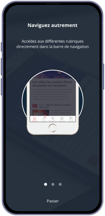
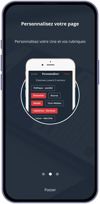
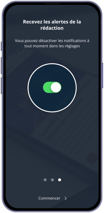
Onboarding screens
The new onboarding screens introduce users to the app’s refreshed design with clarity and ease. Each screen highlights key new features through clean layouts and concise visuals, making discovery intuitive from the very first tap.
05. CONCLUSION
Key learnings from this project
Build an evolutive product, not a feature dump
A solid digital product grows over time. Instead of trying to cram every idea into the first release, we focused on a clear MVP that delivered real value fast. From there, we created a roadmap to organize future features, prioritize improvements, and stay aligned with user needs. This approach kept the experience clean, manageable, and scalable—both for the team and the people using the app.
Bridging the gap between stakeholders and developers
With the development team based outside Paris, full-group meetings were rare, so maintaining alignment became a key part of the design role. I acted as the link between journalists, stakeholders, and developers—gathering insights during reviews, clarifying expectations, and translating needs into actionable feedback for the dev team. Each group had a different perspective on the product, and design helped unify those visions around shared goals.
Structuring the experience with a Design System
Long before “design system” became a buzzword, we built a complete library of mobile components, visual assets, and interaction rules. This toolkit allowed us to move faster, maintain visual consistency, and keep the hierarchy clear across screens. It streamlined collaboration and ensured the product felt cohesive, even as the team explored new features and layouts.
Test early, test often
A digital product without real users is just a guess. We ran usability tests with people from Les Echos as well as users unfamiliar with the app to gather a broad range of insights. Their feedback helped us validate assumptions, uncover friction points, and refine the experience. Testing gave us clarity, confidence, and a stronger product vision.
Dare to innovate and explore
A mobile app is a creative playground, and we used it to experiment with new technologies from Apple and Google—widgets, AMP, and other emerging features. Some ideas weren’t the perfect fit, but exploring them opened new perspectives and occasionally sparked fresh concepts. Innovating isn’t just about finding the next big thing; it’s about staying curious and pushing the product further.
