Sud Express
ABOUT THE PROJECT
Where elegance meets intention
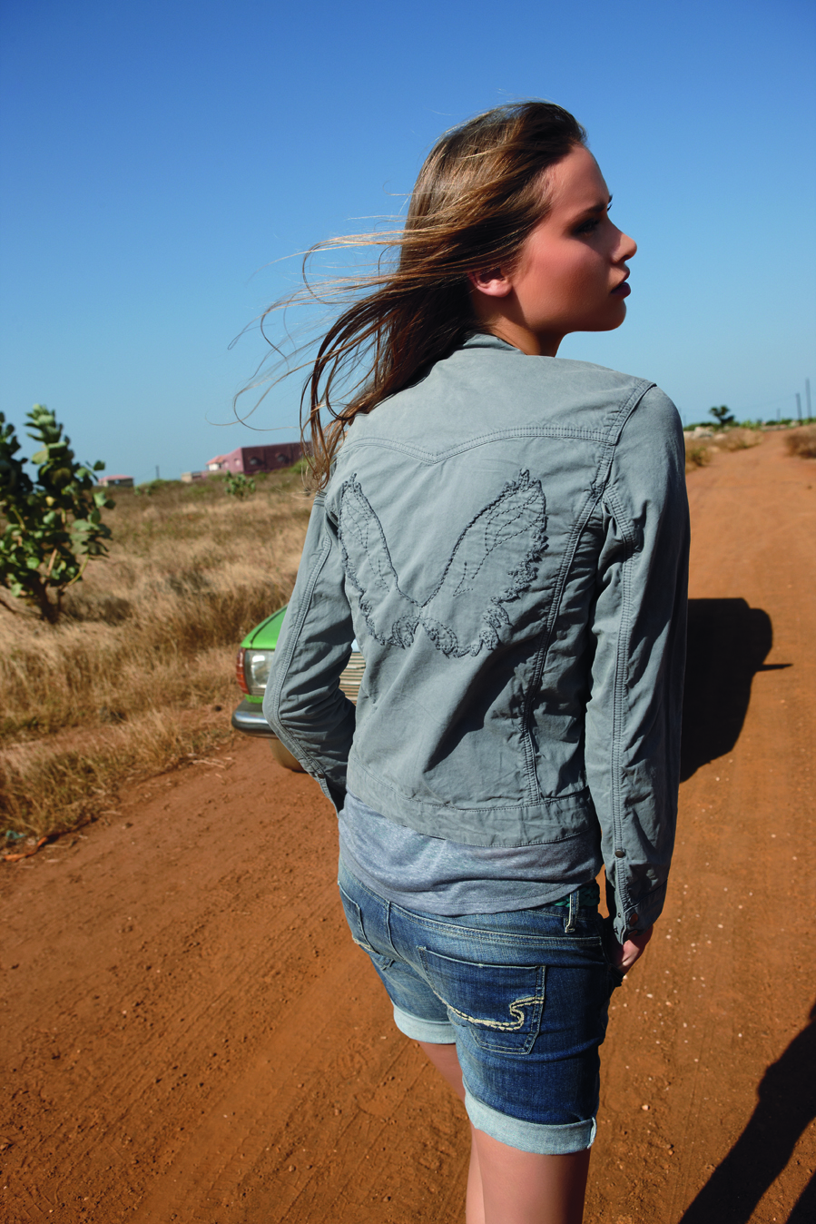
This project was conceived as a refined digital showcase for the brand Sud Express, where aesthetic precision defines the experience. The objective was clear : elevate the brand through a visually immersive environment that celebrates the quality, texture, and detail of each piece.
High-resolution imagery takes center stage, framed by a restrained, minimalist interface designed to disappear in favor of the product. Generous whitespace, subtle typography, and a carefully balanced visual rhythm create a sense of calm sophistication — transforming the browsing journey into a curated, luxury experience.
This project focused on a visual refinement of the existing digital experience. Rather than redefining structure or user flows — already proven and effective by other projects — the goal was to elevate the brand’s aesthetic expression.
YEAR
2016
ROLE
User Experience
Visual Design
CLIENT
Sud Express
02. DESIGN
Straight to the point
A statement in structure
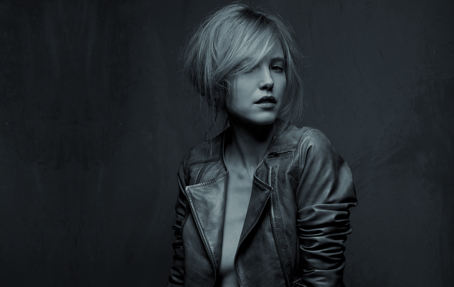
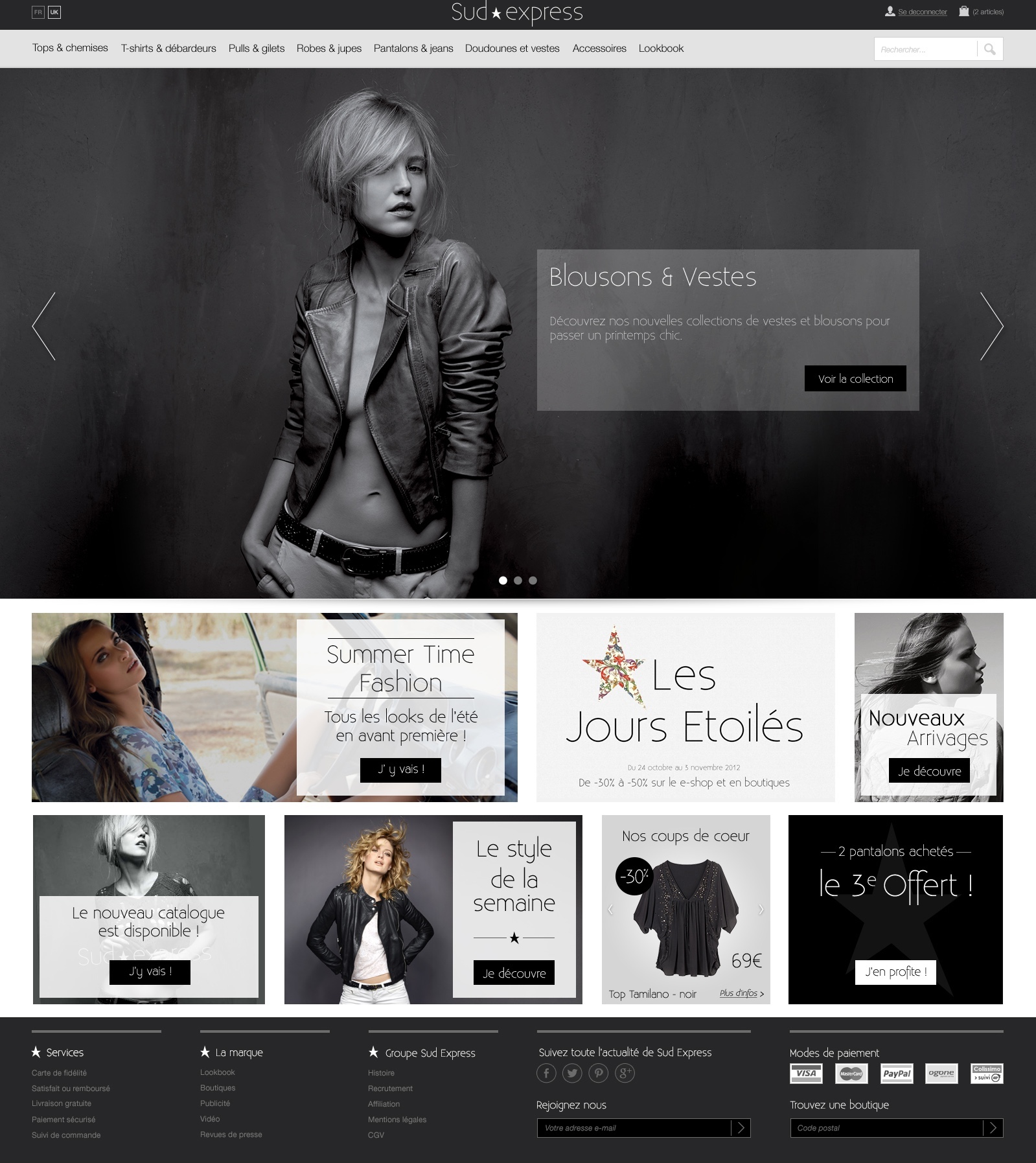
The homepage is built around a bold, immersive hero visual that immediately defines the brand’s presence. This powerful first impression sets a refined and confident tone.
Beneath it, a carefully composed masonry layout structures the content with clarity and elegance. The asymmetrical grid introduces rhythm while preserving hierarchy, allowing imagery and information to coexist seamlessly. The result is a homepage that feels editorial and elevated — visually striking, yet intuitively organized.
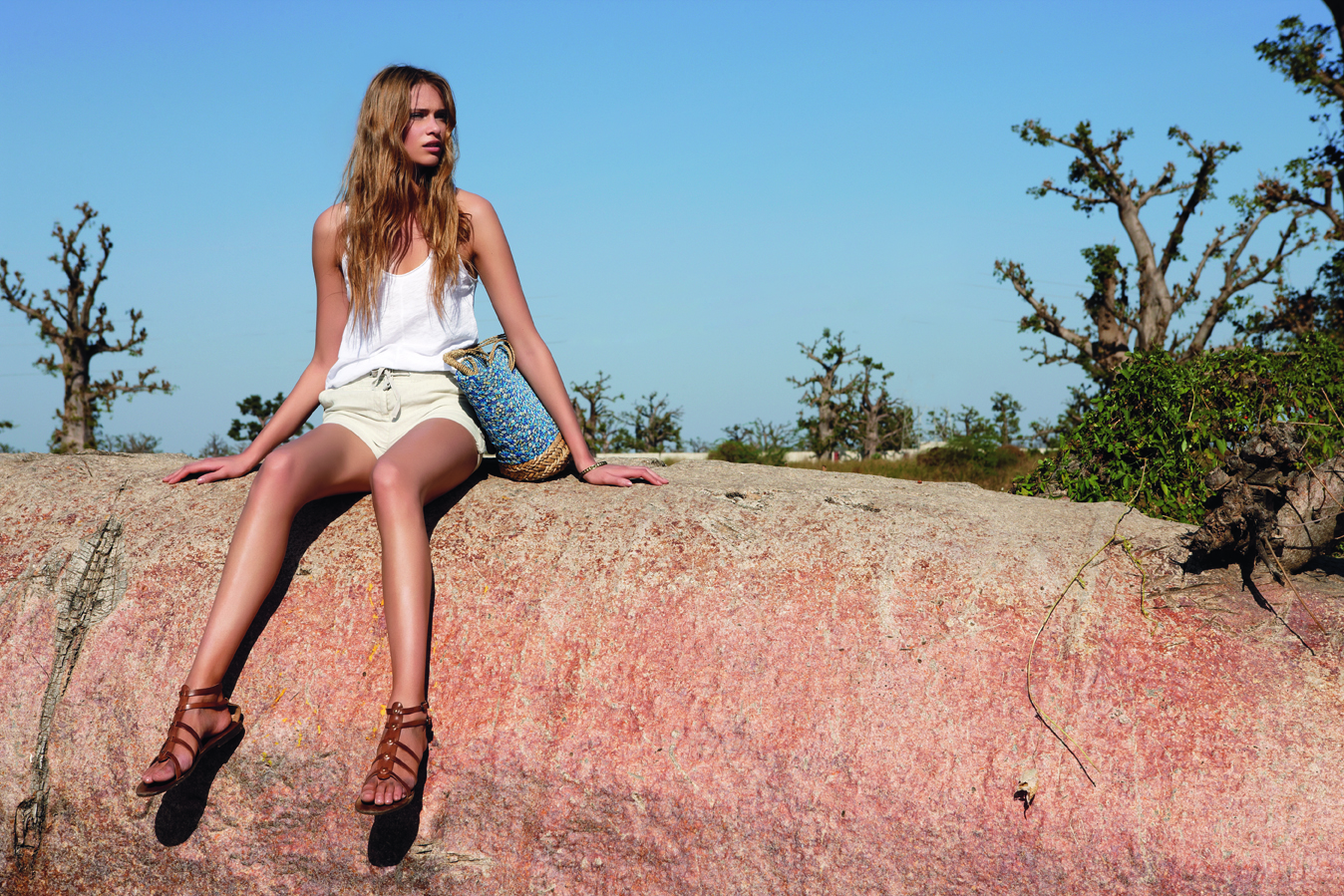
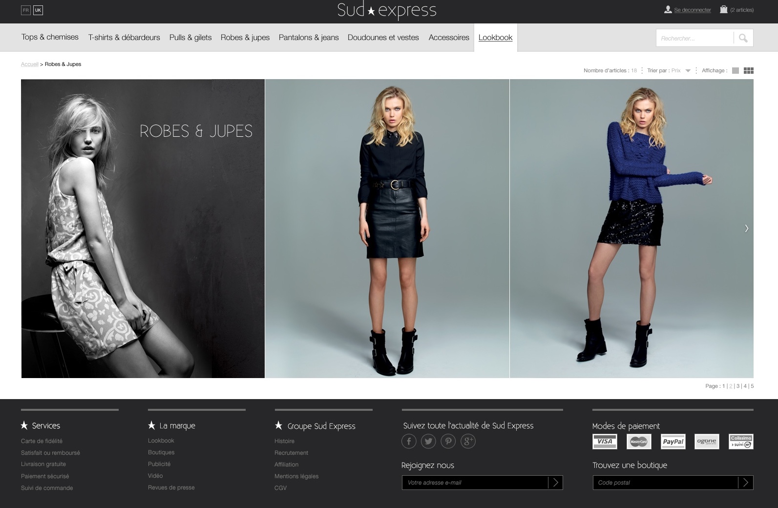
A Canvas for the Collection
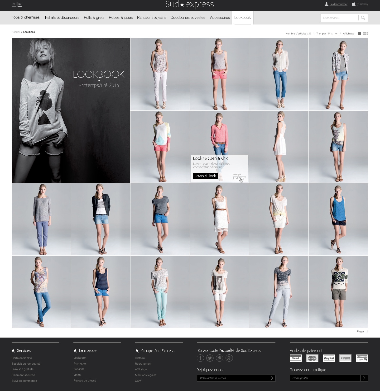
For the lookbook page, a refined visual grid was designed to let the collection fully express itself. The structure is intentionally restrained, creating a calm and immersive viewing experience where the eye naturally flows from one image to the next.
By prioritizing balance, spacing, and rhythm, the layout removes distraction and enhances focus. The result is a curated visual narrative — elegant, seamless, and entirely centered on the content.
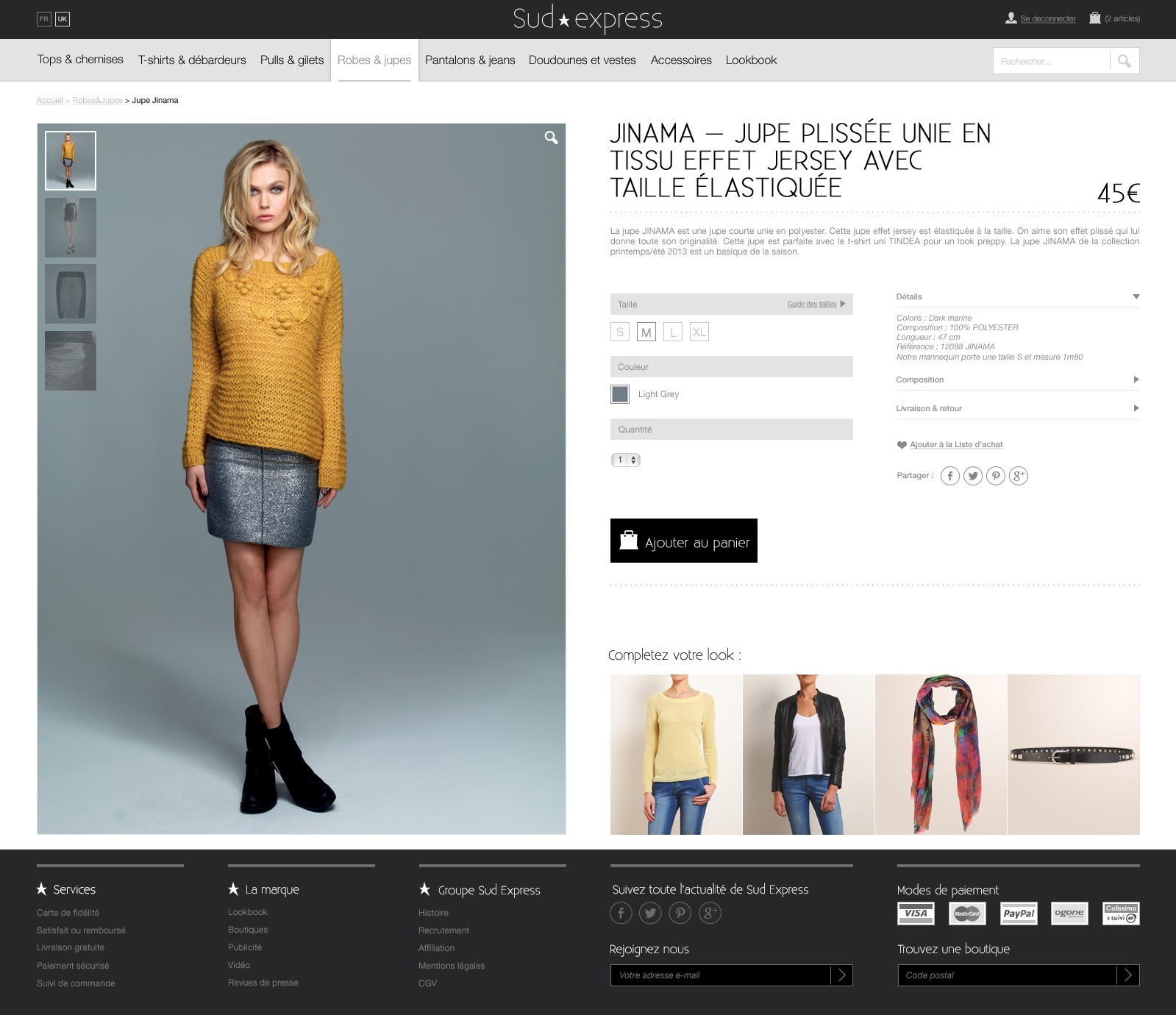
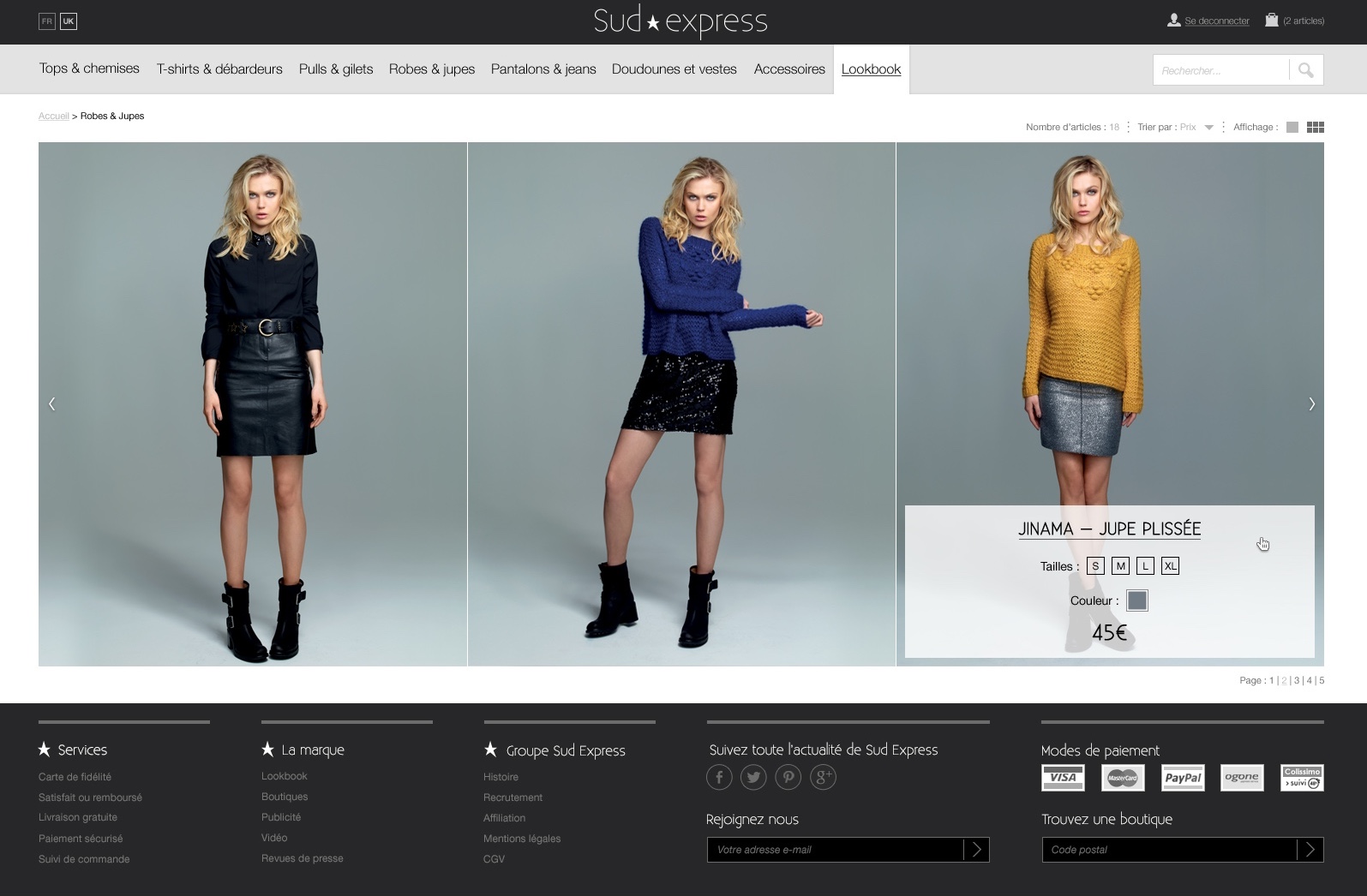
Effortless selection, elevated experience
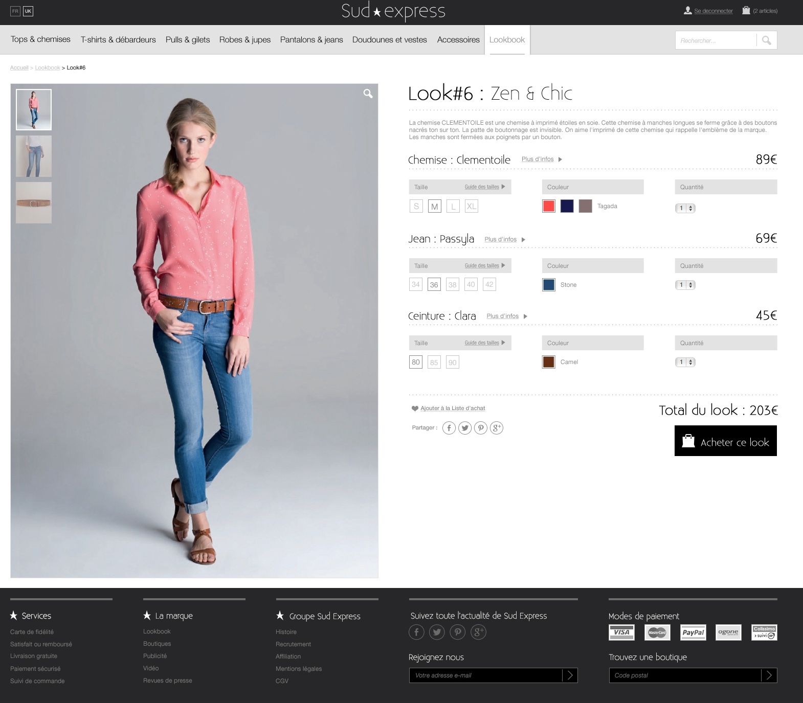
The full-look product page was designed for clarity and fluid interaction. All essential information — from sizing to color variations — is accessible directly within the page, allowing users to explore options without interruption.
By eliminating unnecessary steps and page transitions, the experience remains seamless and intuitive. The layout is carefully structured for quick scanning, ensuring that details, visuals, and purchase actions coexist in perfect balance.
A refined interface that simplifies decision-making while preserving a premium feel.
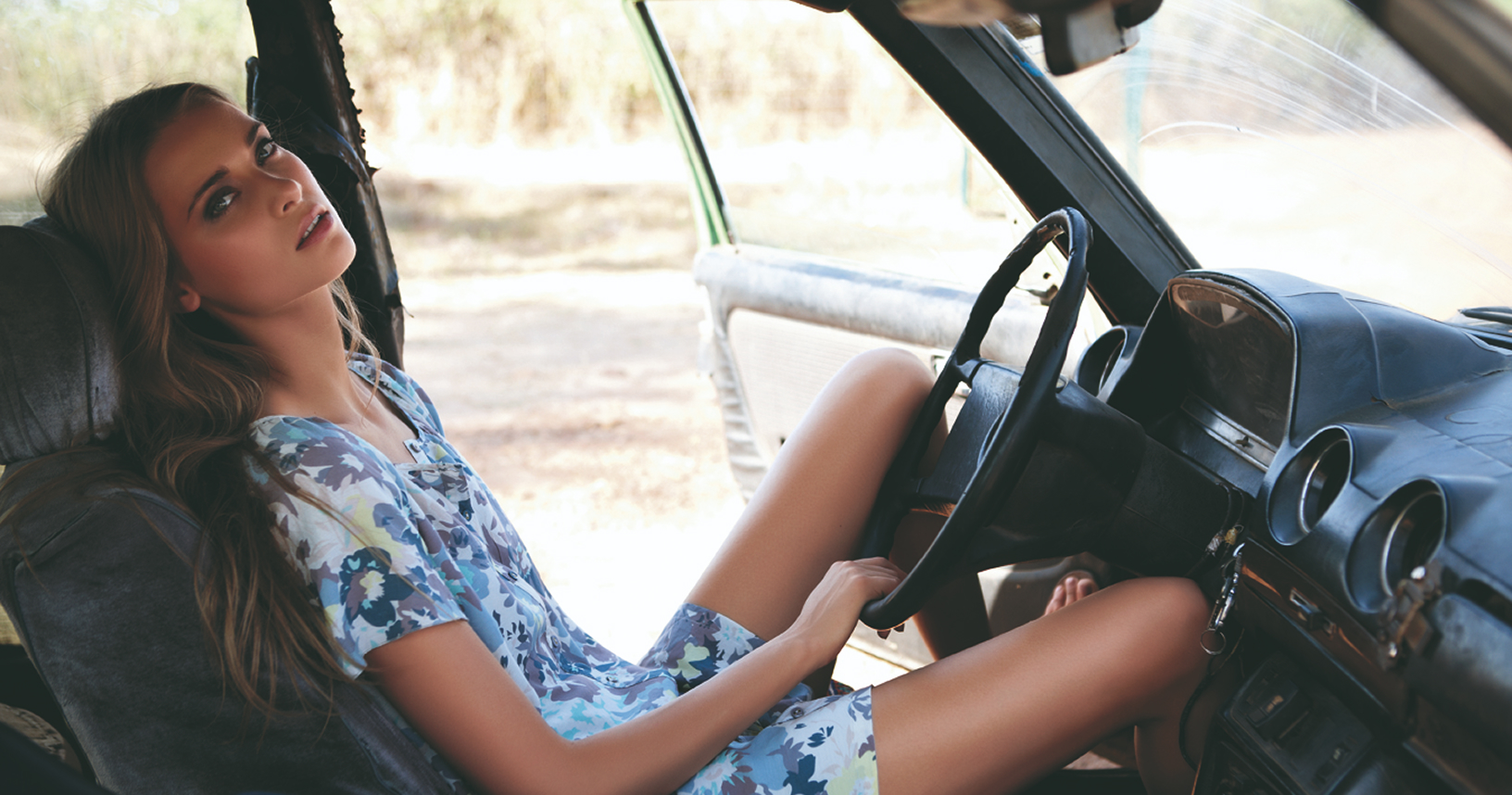
Immersive collections
For the Collection section, the emphasis was placed on the strength and quality of the visuals. A large-format carousel was introduced to showcase products in a more immersive way, allowing users to appreciate textures, details, and silhouettes at scale.
To preserve usability and overview, the experience also offers a grid display option. This dual approach balances emotion and efficiency — combining impactful storytelling with a clear, structured browsing experience.
A balanced composition
For the product page, the design centers around a 50/50 split layout, creating a deliberate balance between emotion and information. One half of the screen is dedicated to immersive, high-quality visuals, allowing the product to fully express its texture, volume, and detail.
The other half focuses on essential information and interactions — sizing, variations, pricing, and actions — structured for clarity and ease of use.
This dual composition ensures the experience remains visually powerful while supporting seamless decision-making, where aesthetics and functionality coexist in perfect harmony.